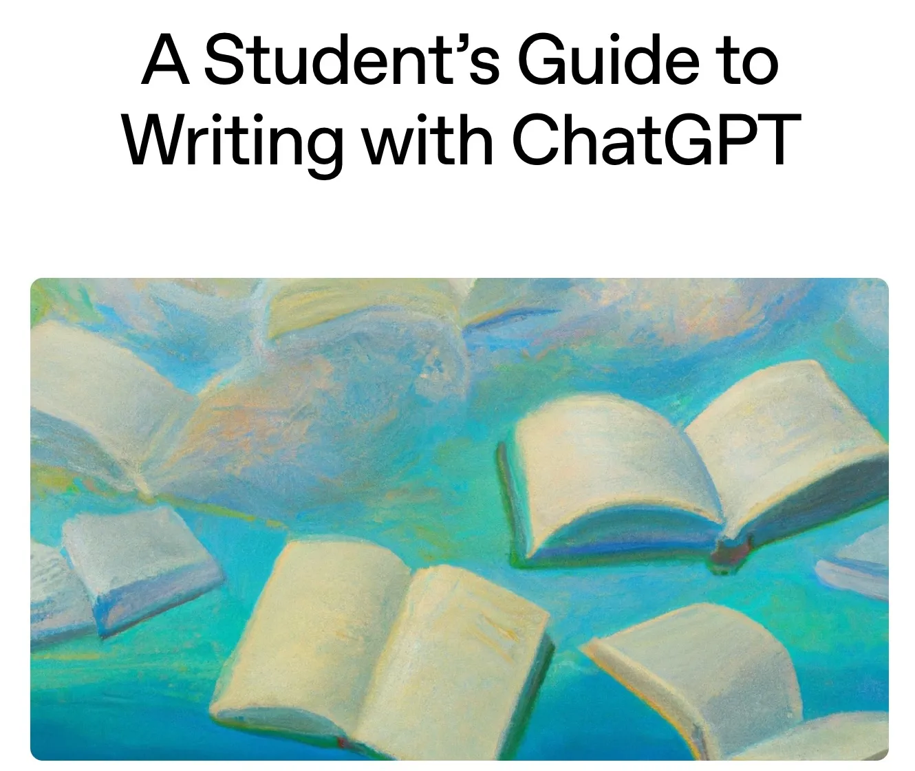
Astro 5 Responsive Images Demo
This page demonstrates the new experimental responsive image features in Astro 5.
1. Responsive Layout (Auto-generates srcset)
Automatically generates multiple sizes for different screen densities:
Uses `layout="responsive"` to automatically generate srcset
2. Fixed Layout (Maintains aspect ratio)
Fixed size that maintains aspect ratio:
Uses `layout="fixed"` for consistent sizing
3. Fill Layout (Fills container)
Fills its container while maintaining aspect ratio:
Uses `layout="fill"` with `fit="cover"` to fill container
4. Image Cropping
Different cropping options using `fit` and `position`:
Cover (default)

Contain

Fill
Different `fit` options: cover, contain, fill
5. Position Control for Cropping
Control which part of the image is visible when cropped:
Top

Center (default)
Attention (smart crop)
The `position="attention"` uses Sharp's smart cropping to focus on the most interesting part
6. Art Direction for Different Screen Sizes
Different crops for mobile vs desktop:
Resize your browser to see different images on mobile vs desktop
7. SVG as Components (New Feature)
With the experimental SVG flag, you can now import and use SVGs as components:
---
import Logo from '../assets/logo.svg';
---

<!-- Use SVG as a component with props -->
<Logo width={100} height={100} fill="blue" />