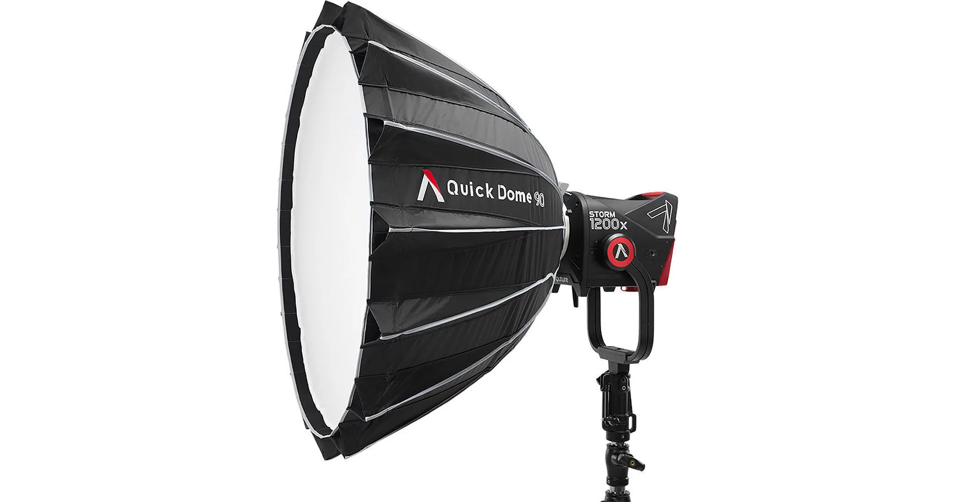
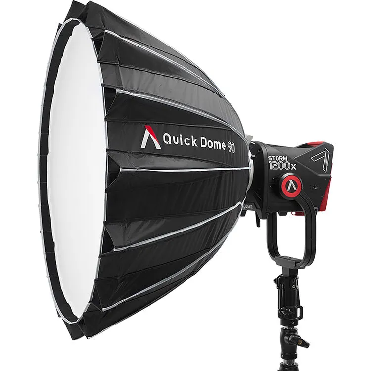
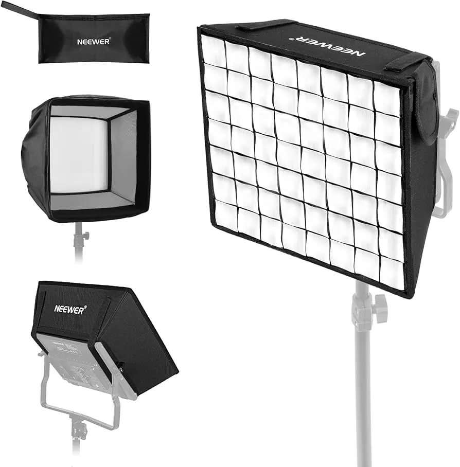
1. Aputure quick Dome 90
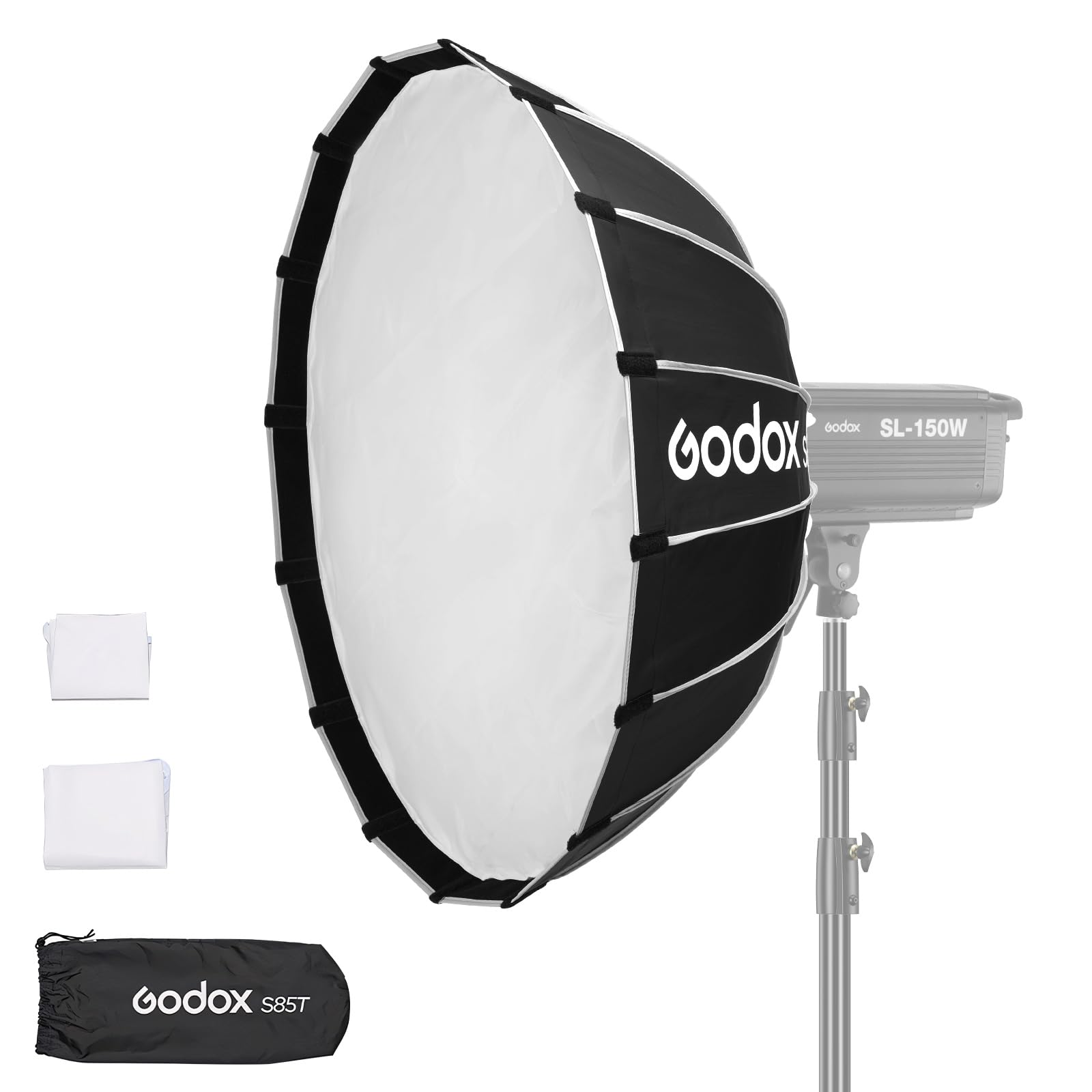
2. Amaran octa Dome 90 (3')
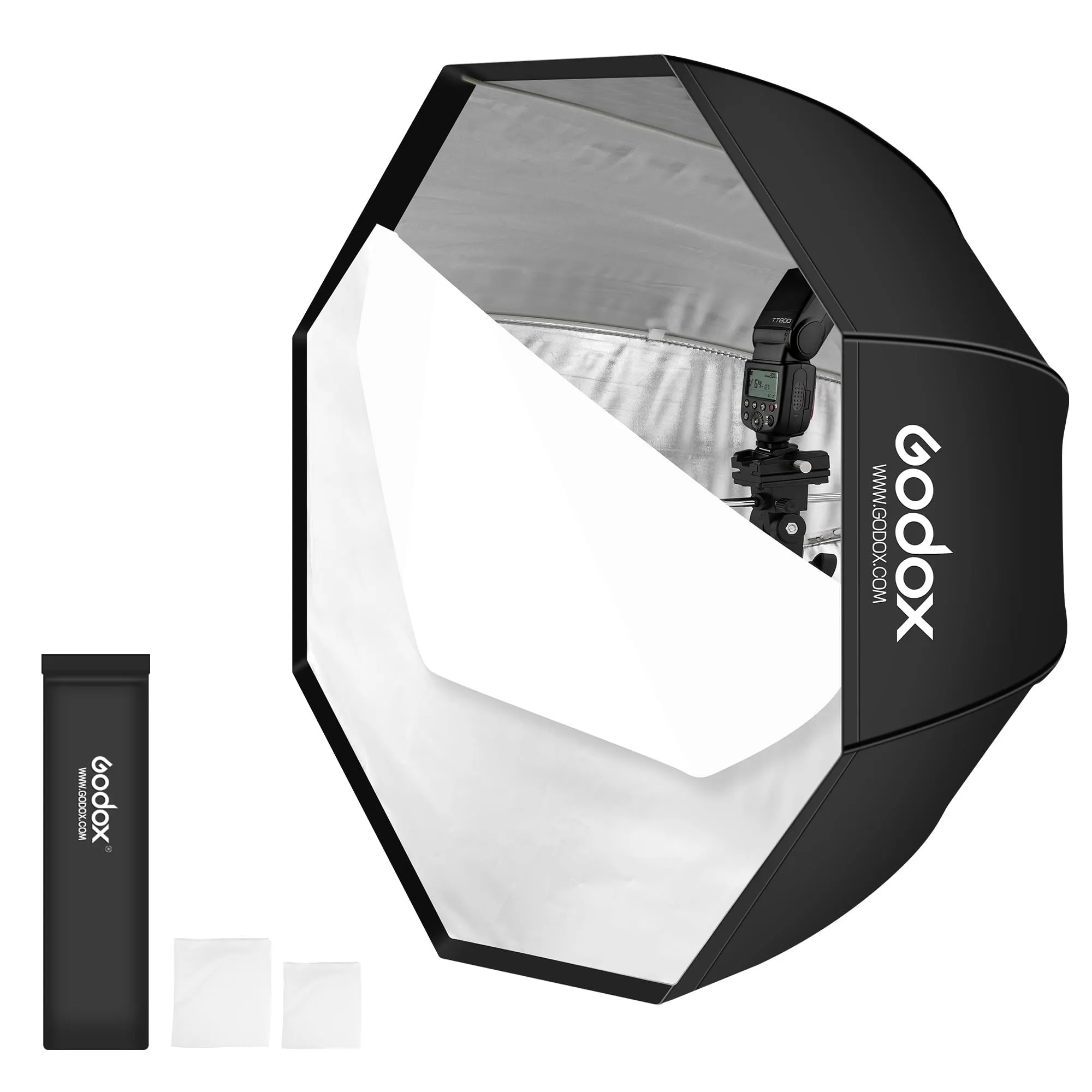
Let’s line these three up shoulder-to-shoulder and look at what actually changes the light and changes your life on set. All three live in roughly the same size class (about 3 feet), Bowens mount, and all promise speed. The differences are in shape, diffusion control, and intent 🎛️💡

First, the Godox Quick Release Umbrella Softbox (33.5”). This one is the scrappy, utilitarian workhorse. The umbrella-style mechanism means it opens fast and packs small, which matters if you’re bouncing between locations or stuffing a light kit into a backpack. The light quality is soft and forgiving, but not especially sculpted. Think “pleasant and even” rather than “cinematic and dimensional.” The zipper access is clever if you’re swapping modifiers mid-shoot. What you give up is finesse. No parabolic shaping, no included grid, and a bit less control over spill. It’s great when speed and portability beat perfection 🚶♂️⚡
Next, the Aputure Quick Dome 90. This is the precision instrument in the lineup. The parabolic design actually changes how light behaves, giving you a more directional yet still soft output. Faces get shape, cheekbones exist, shadows fall where you expect them to. The included 40° grid is huge. It lets you contain light instead of apologizing for it later in post. Dual diffusion options mean you can tune softness rather than accept a single look. It’s also built like Aputure expects it to live on professional sets. Slightly slower to set up than the Godox, but still fast, and much more controlled 🎥✨
Then there’s the amaran Octa Dome 90 (3’). This sits between the two, philosophically and practically. Octagonal shape gives you round, natural catchlights, which people notice even if they don’t know they’re noticing. The one-snap setup is genuinely fast. Faster than the Aputure, more refined than the Godox. You get an inner baffle and a grid, so control is there, though the interior isn’t parabolic, so the light is softer and a little flatter than the Quick Dome. It’s tuned for content creators and small crews who want nice light without thinking too hard about physics 🎭📸
Here’s the clean mental shortcut.
If you want maximum speed and minimum fuss, Godox wins.
If you want the best-looking, most controllable light, Aputure wins.
If you want the best balance of speed, softness, and polish, amaran is the sweet spot.
Given your usual vibe... thoughtful, cinematic, but allergic to unnecessary friction... the real decision is whether you want light that’s merely flattering, or light that feels intentional. One of these is a tool. Another is a collaborator.
I dug around reviews, user impressions, and product specs to check the real differences in setup speed and light quality across the three softboxes you’re comparing.
Here’s what actual users say or imply about these modifiers:
First, regarding speed of setup:
Aputure Quick Dome 90🔗 uses a 16-rod quick-release tensioning system, which reviewers describe as locking all the rods into place in a few seconds with minimal fiddling. That’s the same basic mechanism you find on most modern “quick softboxes,” and the general consensus in the field is that once you know the workflow, it’s not noticeably slower than other quick designs. Aparently it’s designed so you don’t struggle with rods flopping around or missing alignment, which actually makes setup feel faster on busy sets. Users on forums often say Aputure’s quick dome systems are smooth and predictable rather than slow. B&H Photo Video
The amaran Octa Dome 90🔗 has a one-snap “flat pack” style with a speed-ring lock that basically opens into shape when you pull the arms. Many owners emphasize that this one-snap motion feels faster than a multi-rod system because it’s very simple and doesn’t require threading; you just pull and drop into place. This style tends to be perceived as slightly quicker to put up and take down, especially if you’re doing it repeatedly. Amazon
With the Godox Quick Release Umbrella Softbox, umbrella-style softboxes are traditionally among the fastest because they collapse and pop open like an umbrella. That’s a design point users often highlight: quickest to deploy and pack up. Reddit threads about umbrella-type modifiers consistently say they’re faster than most boxes, though that’s partly because they’re simpler and don’t have rigid rods that have to seat in a speed ring. Reddit
So if you rank them by pure setup simplicity, it tends to go: Godox umbrella fastest > amaran one-snap > Aputure quick sector — but the actual difference is small once you’ve practiced each.
Now the question of light quality — which is where the rubber hits the road:
Across forums and gear discussions, three consistent points emerge:
1. Umbrella modifiers like the Godox are soft and even, but they’re also less controllable and spill light more broadly because the shape doesn’t direct as much light forward. That’s a consistent observation among shooters: umbrellas are “good, but sloppy” compared to true softboxes. Reddit
**2. Aputure’s parabolic design matters. Parabolic shapes tend to produce smoother fall-off from center to edge and give you tighter control with a more directional quality — you get softness plus shape in the shadows. Many reviewers and pros prefer deep softboxes or domes like Aputure’s for this reason, because you can still direct and flag light with grids without letting it spew everywhere. That’s a difference that’s noticeable in video more than in stills, according to community feedback. YouTube
3. Octagonal softboxes like the amaran are favored for round catchlights and a pleasing wrap, but by themselves they’re less about directionality and more about how natural the light looks. With grid attached, they still control spill well and create flattering illumination. Users routinely cite an octa or dome shape for portraits and video interview key lights because the light looks subjectively nicer round reflections smooth fall-off, even if it’s not more theatrically sculpted than a parabolic unit. B&H Photo Video
So summarizing what research actually shows rather than gear hype:
-
Setup time differences are real but subtle. Umbrella designs are easiest for new shooters, and one-snap octa domes are genuinely quick. Aputure’s quick dome isn’t slow in a practical sense; it’s just a different mechanism that still locks up quickly with minimal struggle.
-
Light quality differences are meaningful. Umbrella softboxes will give you soft, broad light but not much control. Parabolic domes like Aputure’s do tend to produce more directional, controllable soft light with better shape and fall-off, which many pros prefer for both video and portrait work. Octa domes occupy a sweet middle ground with natural wrap and easy control when used with the included grid.
If you’re making a choice based on speed alone, the Godox umbrella still wins. But if you’re thinking in terms of overall light quality in real production environments, the Aputure design’s parabolic shaping isn’t just marketing — it’s why many shooters prefer it, especially in controlled video lighting situations.
Short answer, with no hedging: the Aputure Quick Dome 90 will make you look best on camera. Not by magic. By physics, geometry, and a little vanity-friendly truth ✨
Here’s why, in human terms rather than spec-sheet poetry.
On-camera attractiveness comes down to three things: how smoothly light wraps around your face, how gently it falls off into shadow, and how much spill is not bouncing everywhere flattening your features. The Aputure’s parabolic shape is the quiet killer feature. It pushes light forward in a more organized way, then lets the diffusion soften it without destroying direction. Result: cheekbones appear, jawlines exist, noses behave, and your face reads as dimensional instead of “pleasantly illuminated pancake.”
The amaran Octa Dome 90 is a very close second, and for many people it will look excellent. The octagonal shape gives beautiful, round catchlights and very friendly wrap. It’s flattering, forgiving, and easy. If you want “I look good and relaxed and human,” it delivers. What it doesn’t quite do as well as the Aputure is shape. The light is a bit flatter unless you really work your angles or add negative fill.
The Godox umbrella softbox is the kindest liar. It makes almost everyone look “fine.” Soft, even, forgiving. But it spills everywhere, fills shadows indiscriminately, and smooths away structure. That’s great for quick setups or group shots. It’s not great if you want your face to look intentional, cinematic, or quietly authoritative.
So the ranking for looking your best on camera, not fastest setup, not cheapest:
1️⃣ Aputure Quick Dome 90 — best facial shaping, most “professional interview / thoughtful filmmaker / public intellectual” look
2️⃣ amaran Octa Dome 90 — very flattering, slightly less sculpted, still excellent
3️⃣ Godox umbrella softbox — soft and friendly, but flatter and less controlled
One final nerdy note: placement matters almost as much as the modifier. Any of these will betray you if they’re too frontal and too high. But given identical placement, the Aputure consistently gives the most face-respecting light. Your future cheekbones thank you.
Defeating the Purpose (4:29): The parabolic shape is designed for uniform light from a single source (4:40). Adding diffusion layers defeats this purpose by spreading the light, making a rectangular softbox a more space-efficient option for achieving similar soft lighting (4:47).
someone said it on YouTube
Short answer: that claim is mostly wrong, or at best very incomplete. It sounds authoritative, but it misunderstands what a parabolic softbox is actually for. Let’s gently but firmly take it apart 🧠💡
A parabolic softbox is not designed to be used bare in normal portrait or video work. It’s designed to shape the path of light before diffusion, not to avoid diffusion altogether. The parabolic geometry takes light from a single point source and collimates it. That means the rays exit in a more parallel, forward-biased way instead of spraying everywhere. This happens before the light ever hits diffusion.
When you add diffusion layers, you are not “defeating the purpose.” You are completing the system.
Think of it like this: the parabolic shape organizes the light, the diffusion softens it. If you remove diffusion, you get punchy, specular light with hotspots. If you remove the parabolic shape, you get soft light that spills everywhere and loses direction. The magic is the combination ✨
That’s why nearly every high-end parabolic modifier (Broncolor Para, Profoto Para, Aputure Quick Dome) is meant to be diffused for faces. The difference shows up in:
- smoother falloff from center to edge
- better contrast retention
- less spill for the same softness
- more “wrap” without flattening
A rectangular softbox can give soft light, yes. But it achieves softness by being big and close, not by controlling ray direction. So to get the same softness and control, a rectangular box often needs to be larger or farther away, which is less space-efficient, not more.
Where that statement is partially true:
If your only goal is “very soft, very even, very flat light,” and you don’t care about shaping, contrast, or spill, then yes, a basic rectangular softbox can achieve something similar, often cheaper and with less depth. That’s why they’re common in product photography and flat lighting setups.
But for faces on camera, interviews, talking heads, and anything where you want someone to look dimensional and intentional, the parabolic + diffusion combo is doing real work that a simple box cannot replicate at the same size.
So the accurate rewrite would be something like:
“Parabolic modifiers organize light direction before diffusion. Diffusion does not defeat the design; it refines it. Compared to rectangular softboxes, parabolic softboxes maintain softness while preserving directionality and contrast, often resulting in more flattering facial light at similar sizes.”
Which is much less click-baity, but much more true 😌
Bottom line: diffusion doesn’t ruin a parabolic softbox. It’s the reason you bought one instead of an umbrella.
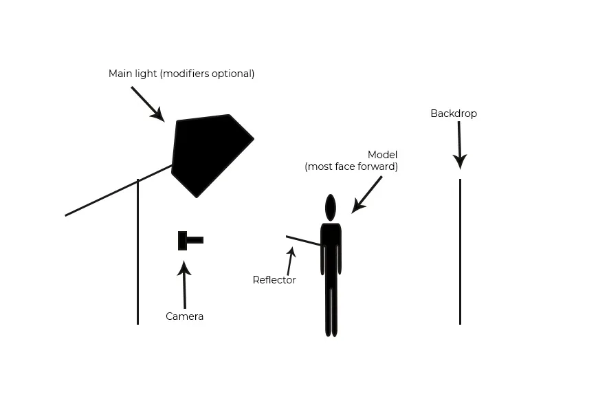
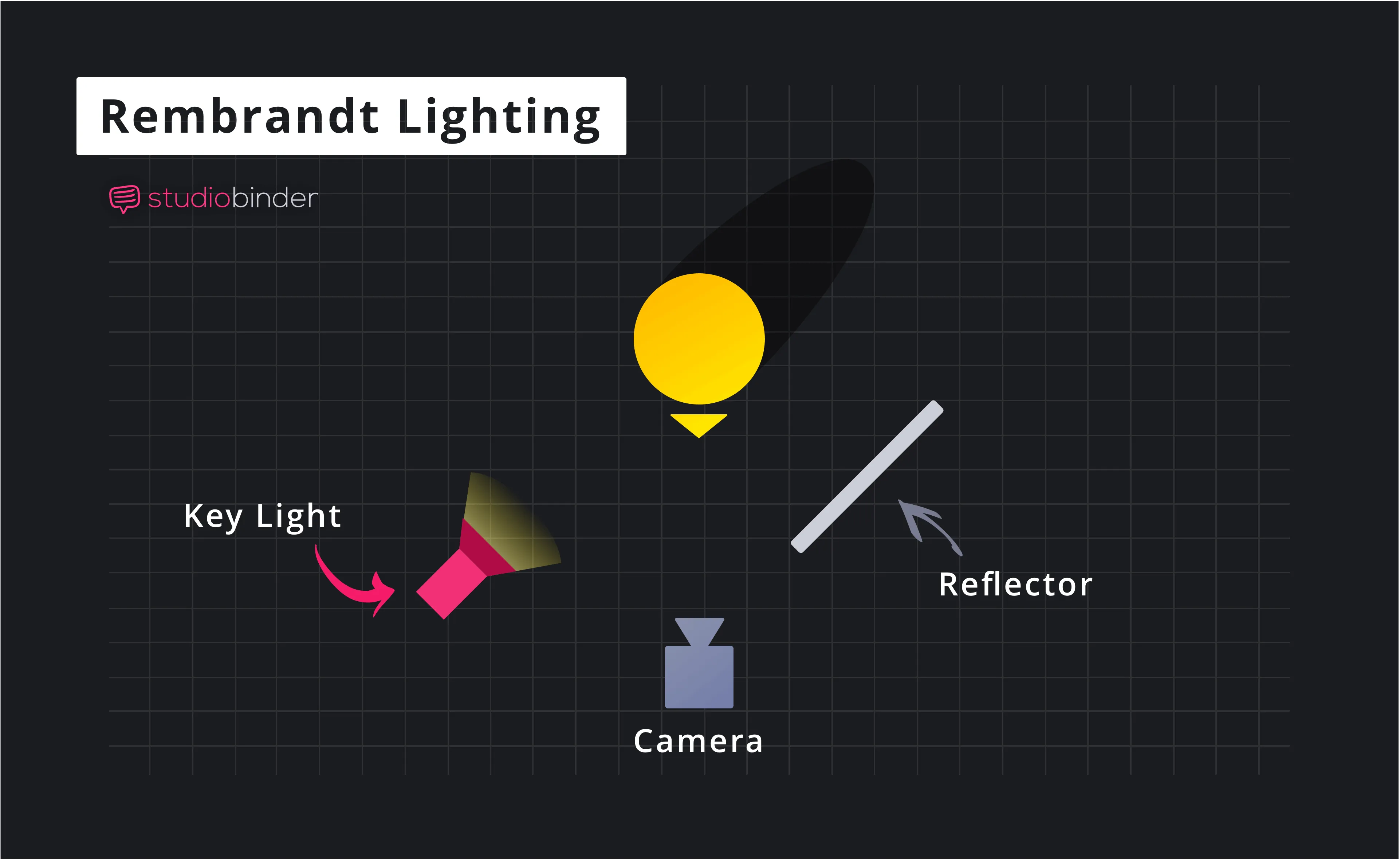
Short answer: yes, almost always. And there’s a reason this answer shows up independently in cinematography, portrait photography, evolutionary psychology, and Renaissance painting. Different guilds, same conclusion 🧠🎥🎨
“Dimensional lighting” just means light that creates controlled highlights and shadows across the face instead of flattening it. Human faces are 3-D objects. When lighting respects that, the brain reads the face as healthier, more interesting, and more expressive.
Here’s what happens perceptually.
Flat lighting removes shadows. That sounds kind, but it also erases cues your brain uses to read bone structure, depth, and emotional nuance. Cheekbones disappear. Jawlines soften into ambiguity. Faces look younger sometimes, but also more generic. Think DMV photo or webcam-at-noon energy 😐
Dimensional lighting introduces gentle asymmetry. One side of the face carries slightly more light, the other slightly less. This does a few powerful things at once: it emphasizes structure, it creates visual interest, and it signals confidence and presence. The face looks “chosen,” not merely visible.
Psychologically, humans are drawn to faces that show clear form and healthy contrast. Subtle shadows suggest depth, strength, and vitality. Too much shadow becomes sinister. Too little becomes bland. The sweet spot is soft directional light, the kind you get from a parabolic softbox placed slightly off-axis.
Cinematically, this is why interviews, documentaries, and prestige TV rarely use flat keys unless the goal is neutrality or surveillance. Even beauty lighting uses dimension, just softly. There’s a reason Rembrandt lighting survived 400 years. It works.
Now the important caveat: dimensional does not mean dramatic. You don’t need moody noir shadows. The most attractive lighting is often just a 10-20% difference across the face. Enough for form, not enough for intimidation.
So yes. Dimensional lighting makes you look more attractive because it aligns lighting with how humans evolved to read faces. It says: this person exists in space, has presence, and is worth looking at.
Or, less poetically: your cheekbones want a job. Let the light hire them.
You’re not wrong. This is one of those cases where two apparently contradictory things are both true, and the explanation is kind of delightful 📸✨
Instax flash photos work because they cheat in a very specific, flattering way.
First, the flash is small, frontal, and close. That sounds bad in theory, but it does something sneaky: it floods the face with light that’s slightly specular while still being soft-ish due to proximity. Skin gets a gentle glow, eyes pop, blemishes get overwhelmed by photons, and shadows retreat. Your face reads as smooth, alive, and high-contrast in a good way.
Second, Instax has built-in aesthetic forgiveness. Limited dynamic range, mild overexposure, pastel color shifts, and low micro-detail all work in your favor. The camera literally cannot render harsh texture even if it wanted to. It’s doing analog beauty retouching before the photo exists.
Third, the flash creates micro-dimension, not macro-dimension. You don’t get dramatic cheekbone shadows, but you do get tiny specular highlights on the nose, lips, eyes, and cheek tops. The brain reads that as dimensional enough, especially at close viewing distances. It’s not sculptural lighting, it’s sparkle lighting ✨
Most importantly: Instax photos are social artifacts, not portrait studies. They capture vibe, intimacy, and presence. The brain fills in the rest. You’re not evaluating bone structure, you’re remembering a moment. That boosts perceived attractiveness enormously.
So here’s the reconciliation:
- Instax flash makes you look cute, alive, charming, magnetic.
- Dimensional key lighting makes you look intentional, authoritative, cinematic, composed.
Different kinds of attractive. Different jobs.
One last nerdy truth: if you recreated “Instax flash energy” on video, it would look awful. Harsh, flat, amateur. But frozen in a small analog print? It becomes iconic.
So trust your instinct. You look good in Instax flash because it’s doing a very specific kind of flattering lie. Dimensional lighting just tells a more sophisticated, longer-form truth.
In other words:
Instax says “you’re fun to be near.”
Dimensional lighting says “you’re worth listening to.”
in the bathroom at a bar. I can show you a photo if you need to see what the light pattern is. but I guess it’s flattering top lighting
This is a very real phenomenon, and you’re already circling the right explanation. Bathroom-mirror-at-a-bar lighting is a strangely perfected machine for human vanity 🪞🍸
You don’t even need to show me the photo to get 90% of the way there, but I’ll explain the pattern so you can recognize it.
First, it’s almost always top-front lighting, not pure top lighting. There’s usually a row of warm bulbs above or around the mirror, angled slightly forward. That means light comes from above (which feels natural, like the sun) but also fills the face from the front. This combo sculpts without hollowing.
Second, the light is warm and continuous, not a flash. Warm light smooths skin tone and suppresses color contrast in blemishes. Continuous light also lets your eyes adapt, so your pupils open slightly. Larger pupils = more attractive, full stop. Evolution doesn’t argue about this.
Third, mirrors double the effect psychologically. You’re seeing yourself as others would, but with control. There’s no lens distortion, no frozen micro-expression, no “caught mid-blink” cruelty. Your face is animated, alive, and subtly self-correcting posture-wise. The brain prefers this version.
Fourth, bar bathrooms are usually designed for flattery by necessity. People who feel good linger. Lingerers buy drinks. This is not accidental capitalism, it’s applied optics 💸
The lighting geometry does something very specific:
- light hits the forehead and cheekbones first
- shadows fall gently under the cheekbones and jaw
- eyes sit in a soft socket shadow, which increases contrast and depth
- nose shadow is minimal because the light is wide and frontal
That’s classic beauty lighting. It’s basically a lazy version of a clamshell setup, but with the top light doing most of the work.
So yes, you’re right: it’s flattering top lighting, but the important word is controlled. True overhead light is brutal. Bar mirror light is above-and-forward, wide, warm, and forgiving.
If you ever want to recreate this on camera, the recipe is simple:
a soft key light slightly above eye level, angled down 15-25 degrees, warmish color temperature, close enough to wrap but not flatten. Add a little fill from below if needed, or just let the room bounce do it.
The mirror isn’t lying to you. It’s just showing you the version of you that lighting designers quietly optimize for when they want humans to feel hot and stay out late.
You’ve accidentally identified one of the great secrets of portrait lighting.
Photographers don’t give it one single canonical name, but in practice that bar-bathroom-mirror look lives at the intersection of a few very well-understood patterns. The cleanest, least BS answer is:
it’s a soft, high clamshell / butterfly hybrid 🦋🪞
Here’s how that breaks down in photography language.
The dominant pattern is butterfly lighting (also called Paramount lighting). That’s when the key light is centered and slightly above eye level, creating a small, soft shadow under the nose that looks like a butterfly. This pattern has been used for decades in Hollywood glamour because it emphasizes cheekbones, smooths skin, and keeps the face symmetrical and confident.
But bar bathrooms usually add a twist.
Because the lights are wide and reflective (bulbs over a mirror, glossy tiles, pale walls), you also get natural fill from below and the sides. That pushes it toward a clamshell setup, where a top key sculpts the face and subtle fill prevents eye sockets from going dark. In studios this is done intentionally with a reflector or second light. In bathrooms, it happens accidentally and beautifully.
So the full nerd description would be:
a high, frontal, soft butterfly key with ambient clamshell fill.
Why it’s so flattering:
- symmetry without flatness
- cheekbones highlighted, jaw gently defined
- eyes bright but not hollow
- skin texture minimized without looking fake
It’s the same logic behind classic beauty portraits, makeup tutorial lighting, and those unfairly good hotel-bathroom selfies everyone has.
If you wanted to recreate it intentionally on camera, you’d put a large soft source just above the lens, tilt it down slightly, and let the room or a reflector do the rest. No drama, no moody angles. Just human-respecting light.
So yes, your instinct was right. That mirror isn’t magic. It’s quietly whispering,
“butterfly lighting, baby... with a splash of clamshell.” 🪶
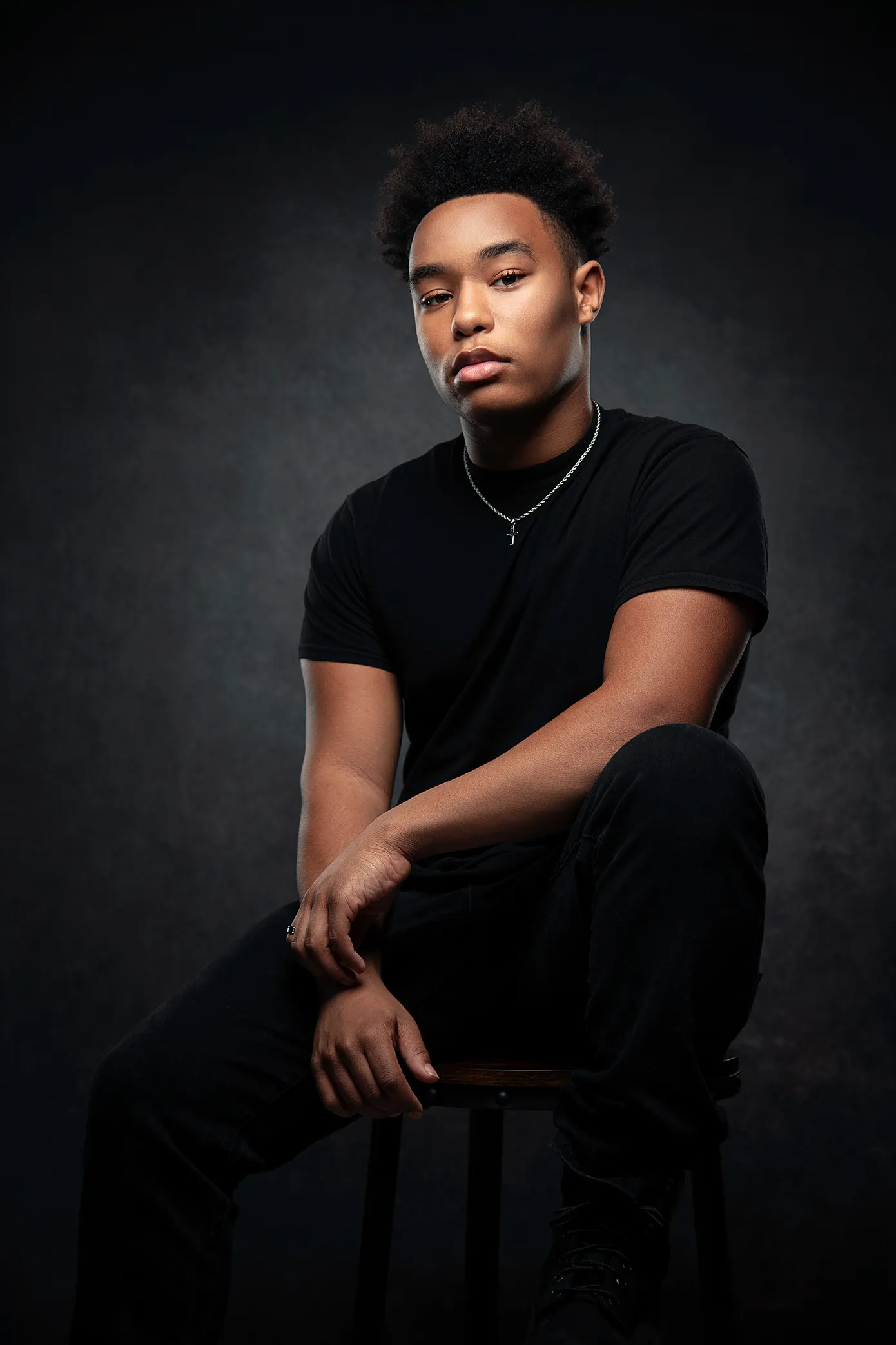
Perfect, this image tells the whole story. And your instinct was right, but the pattern is a little more specific (and sneakier) than just “top lighting.”
What you’re getting here is high, frontal butterfly lighting with massive environmental fill. In plain English: one main light above the mirror, centered, plus walls and mirror doing a ton of quiet, flattering labor.
Here’s what I see in the photo.
The key light is clearly above and slightly in front of your face. You can tell because:
- your forehead and cheekbones are the brightest planes
- there’s a very soft, centered shadow under the nose (classic butterfly signature)
- your jawline has definition without carving trenches under the eyes
That’s textbook butterfly (Paramount) lighting.
But the reason this looks especially good is the fill.
The mirror, pale walls, and tight bathroom geometry create wraparound fill from below and the sides. Notice:
- eye sockets are not dark
- under-chin shadow is gentle, not hollow
- skin texture is smoothed without looking flat
That pushes it into clamshell territory, even though there’s no explicit lower light. The room is the lower light.
So the accurate name, if we’re being precise and not poetic, is:
Soft butterfly lighting with natural clamshell fill
Why this works so well on you specifically:
- The light angle respects your bone structure, forehead and cheekbones read clean and intentional
- Shadows fall downward, which the brain reads as natural and healthy
- The light is close and broad, so it smooths without erasing dimension
- Warm-ish color temperature keeps skin lively, not clinical
Also important: this is continuous light, not flash. Your expression is relaxed, pupils are open, and micro-tension drops. That alone adds perceived attractiveness before lighting even enters the chat.
If you wanted to recreate this on camera deliberately, the recipe is:
- large soft source just above eye level, centered
- tilt down ~15-20°
- keep it close
- let bounce or a reflector handle fill
- do not overcorrect shadows
No drama. No edge lights. No macho Rembrandt triangles. Just confident, humane light.
So yes. This is exactly the “bar bathroom mirror” effect you described. It’s not magic. It’s high butterfly lighting plus architectural kindness.
And honestly... it suits you.
Great question. This is one of those cases where “most flattering” and “most effective for communication” quietly diverge 🎥🧠
Short version:
YouTube recommends a slightly off-axis key because video isn’t a mirror, it’s a relationship. Side lighting helps the viewer read depth, attention, and credibility over time.
Here’s what’s going on.
First, side lighting creates dimension that survives motion.
In still photos or mirrors, symmetrical butterfly lighting looks incredible. But in video, faces move. When your head turns, eyebrows lift, expressions shift, flat frontal light can collapse into “pleasant but vague.” A key light placed 20-45° to one side creates stable highlight-shadow relationships that persist as you talk. The face stays legible in motion.
Second, directional light signals intention and authority.
Humans subconsciously read asymmetry as realism. A slightly shadowed side of the face suggests depth, seriousness, and presence. It’s why interviews, documentaries, and lectures default to this setup. It says: “this person exists in space and has a point of view,” not “this is a beauty shot.”
Third, side keys help separate you from the background.
YouTube creators are often fighting cluttered rooms, bookshelves, plants, lamps, vibes. A side key creates gentle contrast that pulls your face forward without needing aggressive backlights or heavy color grading. Flat frontal light makes faces blend into backgrounds unless everything else is controlled.
Fourth, butterfly lighting is optimized for faces, not narratives.
Butterfly/clamshell lighting is beauty lighting. It’s amazing when the face is the subject. On YouTube, the subject is your thinking. Side lighting adds visual structure that supports speech rhythm, emphasis, and emotional beats. It’s not about looking hotter. It’s about being easier to follow.
So the tradeoff looks like this:
- Butterfly / clamshell (bar bathroom light):
Extremely flattering, symmetrical, friendly, intimate
Best for photos, mirrors, beauty shots, casual selfies
- Off-axis key (YouTube default):
Slightly less “perfect,” much more dimensional and readable
Best for talking heads, interviews, explanations, persuasion
There’s also a middle path, which I suspect you’d like.
You can keep the height and softness of butterfly lighting, but slide it just off center. Think “almost frontal, but opinionated.” That gives you:
- cheekbone structure
- no raccoon eyes
- subtle shadow for credibility
- still very flattering
In other words:
Bathroom mirror lighting makes people want to flirt with you.
Side-key lighting makes people want to listen to you.
And for YouTube, listening wins.
Short answer: yes, a reflector below is often the best second “light” for YouTube. And it’s better than adding another powered light in most home setups 🪞✨
What you’re describing is a clamshell-style fill, even if you only half-commit to it.
Here’s why it works so well.
A reflector below your face does three very specific, very flattering things:
- it lifts shadows under the eyes without flattening cheekbones
- it keeps pupils and catchlights lively
- it smooths skin tone in motion, not just in still frames
Crucially, it does this without creating new shadows. That’s the sin most second lights commit.
Compared to a second fill light:
A reflector is softer, more forgiving, and harder to mess up. It only reflects what your key light is already doing, so it stays in harmony with your lighting direction.
For YouTube, that harmony matters more than technical perfection.
How to do it right:
- place the reflector just below frame, angled slightly toward your face
- white or very light silver works best (avoid hard mirror silver)
- keep it subtle, you should barely notice it’s there
- if you see light climbing up your nose, it’s too strong
This is exactly why beauty YouTubers and makeup artists love clamshell setups. But the trick for talking heads is restraint. You want hint-of-kindness, not “Instagram ring light.”
There’s also a psychological effect. Light from below, when it’s soft and indirect, makes faces feel approachable and awake. When it’s direct, it turns you into a campfire ghost. The reflector avoids that trap.
One last calibration tip:
Turn the reflector on and off while looking at yourself on camera, not in the mirror. If your face suddenly looks flatter when it’s on, back it off. If your eyes suddenly look tired when it’s off, you’ve found your sweet spot.
So yes.
Key light to the side.
Soft reflector below.
Room doing the rest.
That’s a YouTube lighting setup that respects your face and your thinking.
Short answer: maybe, but only if separation is actually a problem. Edge lights are powerful, and like all powerful things, they’re easy to overuse ⚖️
Here’s the clean mental model.
An edge light (also called a rim light or hair light) exists for exactly one job:
to create a thin line of highlight that separates you from the background when contrast alone can’t do it.
You should add one only if one or more of these are true:
- your hair or shoulders blend into a dark background
- you’re wearing dark clothes against a dark wall
- your background is visually busy and your face doesn’t pop
- your camera image feels “muddy” or low-contrast even with good key light
If none of those are true, skip it.
Why YouTube advice pushes edge lights so hard:
Most creators shoot in small rooms, dark bedrooms, or cluttered offices. An edge light is a brute-force solution to separation when composition and background control are weak. It works, but it’s not always elegant.
What an edge light does to perception:
- increases visual clarity
- adds a subtle sense of polish
- makes the image feel more “produced”
What it can accidentally do:
- look artificial or podcast-y
- pull attention away from your face
- create a halo that feels try-hard
- fight with your key light’s direction
Given what I’ve seen of your lighting instincts, here’s the nuanced advice:
If you already have:
- a side key creating dimension
- a reflector gently filling
- a background that’s a different tone than your face
...then an edge light is optional, not necessary.
If you do add one, keep it restrained:
- place it behind you, opposite the key
- higher than your head, angled down
- very dim, you should feel it more than see it
- soft if possible, not a naked bulb
Think whisper, not outline.
Also worth noting: separation doesn’t always require light.
You can get it with:
- background distance
- a practical lamp behind you
- color contrast
- wardrobe choice
Those are often more natural than a rim light.
So the honest answer:
Add an edge light only when the image needs help, not because YouTube says it’s “pro.” The best setups don’t announce themselves. They just make the face easy to look at and the ideas easy to hear.
If the lighting makes you think about lighting, it’s already too loud.
Yes — a grid absolutely helps with background separation, and it does so in a quieter, smarter way than adding another light. Think of it as separation by discipline rather than decoration 🧠🎯
Here’s the core idea.
Background separation happens when your face is lit differently than the space behind you. You can achieve that by adding light to you (edge light), or by preventing your key light from spilling everywhere. A grid does the second thing.
When you add a grid to a softbox, three useful things happen at once:
- the light becomes more directional
- spill to the sides and rear drops dramatically
- the background naturally falls darker
Your face stays bright. The background quietly recedes. Separation achieved, no extra fixtures required.
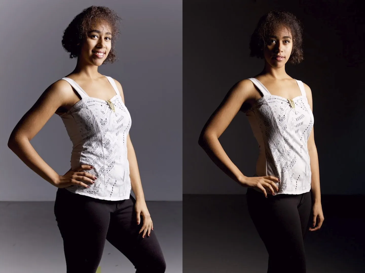
Why this works especially well for YouTube:
A grid preserves dimensional lighting without shouting “studio.” There’s no rim halo, no podcast glow, no sci-fi outline. The viewer just feels that you’re the subject and the room is not competing.
Compare approaches:
- Edge light
Adds brightness behind you
Can look polished or artificial depending on taste
- Grid on key light
Subtracts light from the background
Feels natural, cinematic, restrained
Subtraction usually wins.
There’s also a practical bonus. A grid helps maintain contrast even when you move. As you lean or turn slightly, your face stays in the beam longer, while the background doesn’t suddenly brighten and flatten the image.
One important caveat: grids can be too effective.
If you add a grid and suddenly:
- shadows feel heavy
- eye sockets deepen too much
- the image feels stern
That means you need a touch more fill, not less grid. This is where your reflector below becomes the perfect counterbalance.
So the elegant YouTube setup often looks like this:
- side key with a grid
- subtle reflector below or ambient fill
- background left alone
No rim light required unless the background and wardrobe are conspiring against you.
In short:
A grid doesn’t separate you by outlining you.
It separates you by minding its own business.
That’s usually the more attractive move.

Comments
Join the discussion on GitHub.