




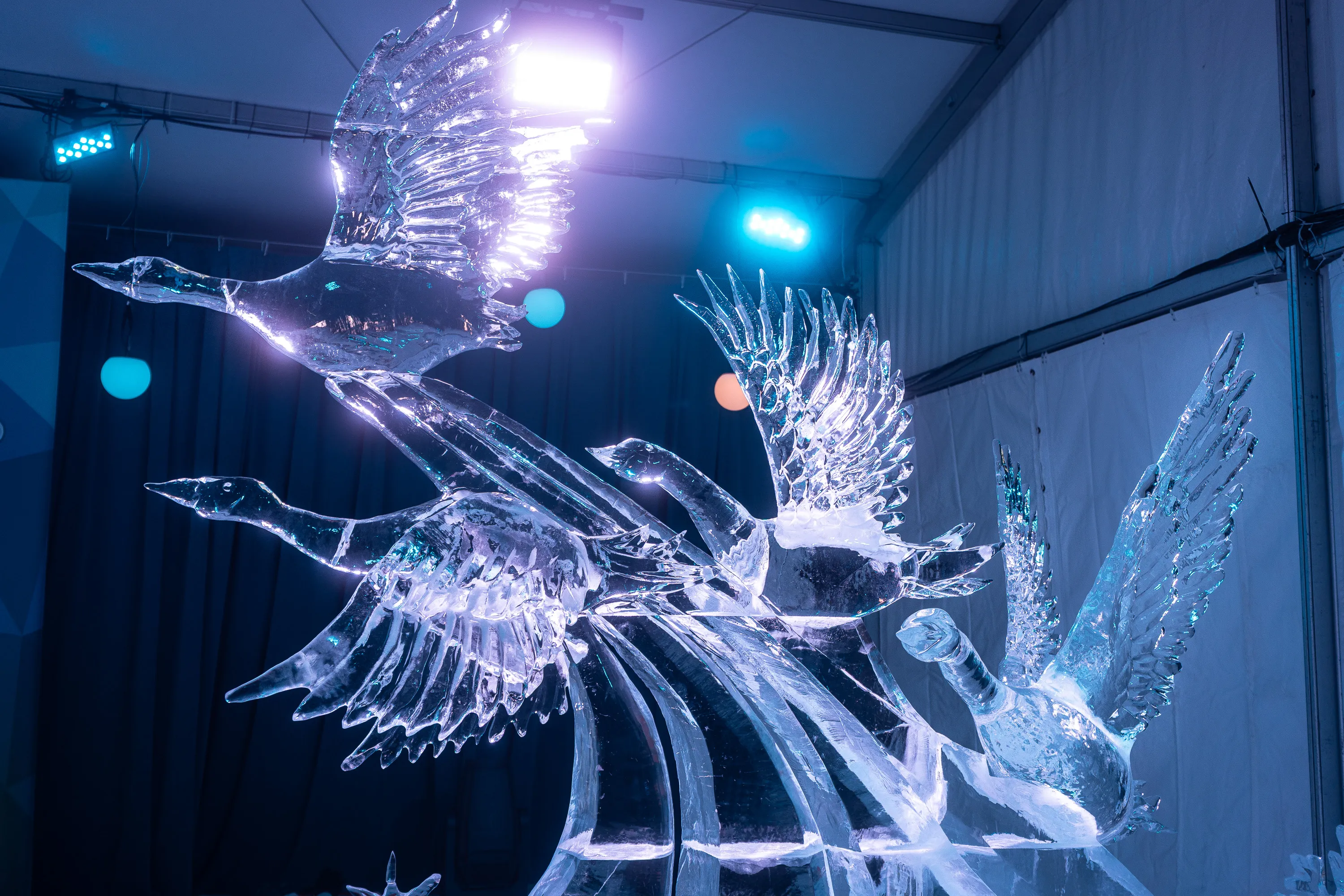
This is already a strong photo. The sculpture reads clearly, the motion is legible, and ice is notoriously hard to photograph without it turning into dead glass. You’ve got a lot going for you. Now let’s sharpen it.
First, composition and framing. The geese themselves are dynamic, but the tent structure keeps reminding us we’re indoors. The right wall seam and ceiling lines pull the eye away from the birds’ flight path. A tighter crop from the right and top would help, especially trimming that bright ceiling area. You want the geese to feel like they’re escaping the frame, not trapped under fluorescent scaffolding. A slightly more aggressive crop could turn this from “documentation” into “image.”
Second, highlight control. The brightest light behind the top goose is doing two things at once. It gives you a halo, which is nice, but it also blows out feather detail and becomes the brightest thing in the image. In post, I’d pull highlights down selectively on that top wing and consider a subtle radial burn around the light source. You don’t want to erase the glow, just demote it so the eye lands on the sculpted wings first.
Third, color temperature and mood. You’re leaning cool blue, which makes sense for ice, but right now everything is uniformly cold. That flattens emotional depth. A gentle split-toning move could help: keep shadows cool, but introduce a hint of warmth in the midtones or highlights. Even a whisper of neutral white or faint amber will give the ice dimensionality and make the carving detail pop instead of reading as one icy mass.
Fourth, background separation. The colored orbs in the background are interesting but ambiguous. They read halfway between intentional bokeh and distracting tent lights. You could either lean into them or suppress them. Leaning in would mean increasing contrast and saturation slightly so they feel like designed accent lights. Suppressing would mean darkening or desaturating them so the geese feel isolated against a quieter backdrop. Right now they’re undecided, and indecision is the enemy of strong images.
Fifth, micro-contrast and texture. Ice loves clarity, but global clarity will make it crunchy fast. Instead, I’d add local contrast selectively to the wings and necks, especially where the carving lines articulate motion. Let the bodies stay smoother. Think of it like sharpening thought, not shouting detail everywhere.
Finally, narrative emphasis. The strongest gesture here is the upward thrust of the lead goose. Everything else should serve that. A subtle vignette, darkening the lower right corner where the rear bird exits, could quietly push the eye up and left, reinforcing the sense of ascent.
Big picture: you’re one or two deliberate editorial decisions away from this feeling like a festival catalog image rather than a nice event photo. The sculpture already has drama. Your job now is to remove competition and tell the viewer where to look, and why.
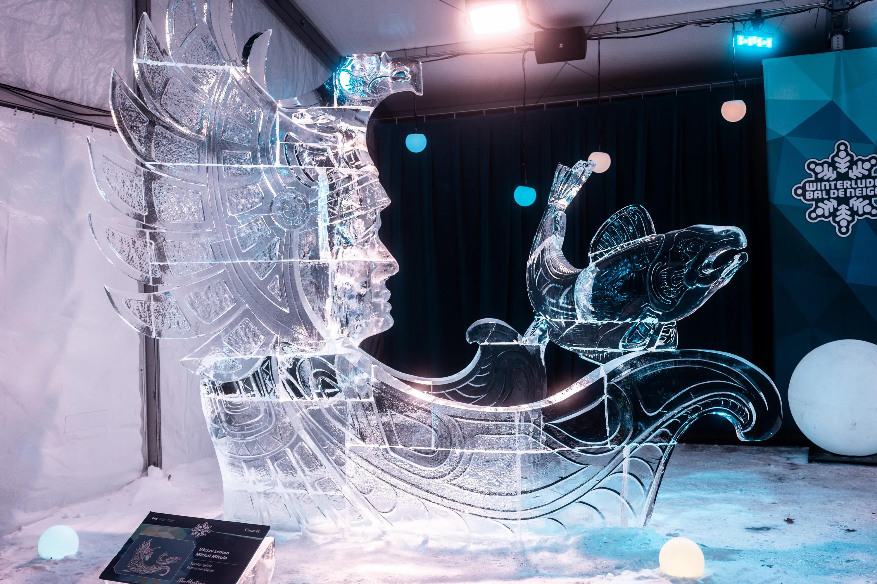
This one is elegant and ambitious. The carving is doing something genuinely hard, layered transparency, negative space, narrative motion. You’re already past “nice snapshot.” Now we refine.
The biggest issue is visual noise competing with the sculpture’s authority.
First, framing and crop.
The left wall seam, ceiling rigging, and the bright ceiling light are all stealing oxygen. The sculpture wants to feel mythic, but the tent keeps saying “temporary installation.” I’d crop tighter from the top and left, even if it means sacrificing a bit of headroom above the headdress. The power here is the profile and the sweeping curve toward the fish. Let that dominate. You can also crop out the placard at bottom left entirely. It’s informational, not visual, and it breaks the spell.
Second, background discipline.
You’ve got three kinds of background competing at once: black drape, white tent wall, and branded signage. Pick one winner. The black drape is the best ally. In post, I’d darken and slightly desaturate everything behind the sculpture except the drape, letting the white wall fall closer to gray and pushing the sign into obscurity. This will immediately elevate the image from “event coverage” to “catalog-worthy.”
Third, highlight hierarchy.
Ice photographs like chrome with trust issues. Right now, some edge highlights are screaming while others whisper. I’d selectively pull highlights on the headdress and face, especially around the forehead and cheek, while adding a touch of local contrast to the engraved lines in the torso and wave. The goal is to make the carving legible as design, not just sparkle.
Fourth, color temperature coherence.
You’ve got cool cyan, neutral white, and a hint of warm spill all coexisting. That can work, but only if intentional. I’d cool the entire frame slightly, then reintroduce warmth only in the face and fish, subtly. That creates a psychological focal point. Humans are wired to look for faces. You can exploit that gently, even in ice.
Fifth, eye path and story.
The strongest narrative is the line from the face to the fish. Everything else should support that arc. A subtle vignette from the lower left and top right would nudge the eye along that curve. Nothing heavy-handed. Think stage lighting, not Instagram filter.
Sixth, micro-cleanup.
A few small distractions are doing disproportionate harm: cables near the ceiling, uneven snow texture at the base, the bright orb on the far right edge. Clone or darken. The sculpture is precise; the environment should not look sloppy by comparison.
Big-picture read:
This image wants to be quietly monumental. Less spectacle, more reverence. Remove reminders of logistics. Shape the light so the carving feels intentional, not incidental. When photographing ice, the job isn’t to show how shiny it is. The job is to convince the viewer it means something before it melts.
You’re close. This is already a strong editorial photograph. One more pass of subtraction and hierarchy, and it becomes something people linger on instead of scrolling past.
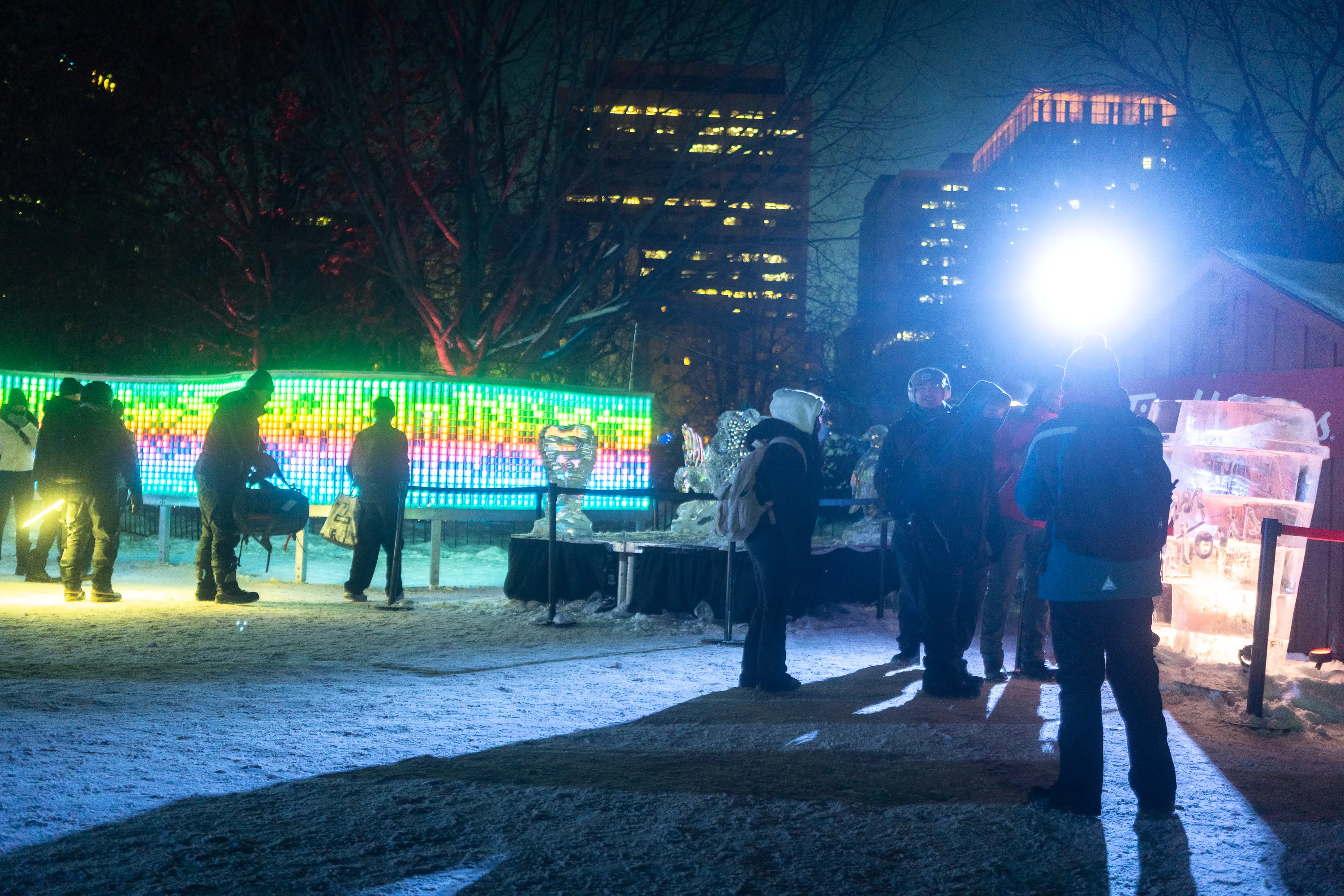
This one is less about polishing a hero object and more about deciding what story you’re telling. Right now, the photo is caught between three different intentions, and they’re all pulling in opposite directions.
Let’s untangle it.
First, narrative clarity.
Is this photo about the ice sculptures, the crowd, or the city-at-night atmosphere? At the moment, the brightest thing in the frame is the blown-out floodlight, the most colorful thing is the LED wall, and the most human thing is the group of people on the right. The ice sculptures, which should be the point, are the quietest element. That’s a classic event-photo trap. To improve this image, you need to pick a protagonist and subordinate everything else.
If the protagonist is the crowd experiencing the art, then lean into silhouette and mood. Let the people go darker and more graphic, embrace the glare of the light as a deliberate halo, and accept that the sculptures are context, not subject. In that version, this becomes a street-photography-adjacent image about winter, public space, and spectacle.
If the protagonist is the sculptures, then the current lighting is actively sabotaging you.
Second, light control and highlight discipline.
That floodlight is nuking detail, creating hard shadows, and flattening the right side of the frame. In post, pull highlights aggressively and consider a local exposure reduction around the light source. Even better, crop tighter from the right so the light is either partially out of frame or pushed to a corner where it feels intentional rather than accidental. Right now it reads as “overpowered by logistics.”
Third, composition and eye flow.
The LED wall is visually fascinating but overwhelming. It’s a horizontal band of high-saturation color that locks the eye in place. Meanwhile, the people on the right are static and vertically stacked. There’s no clear movement path through the frame. A crop from the left that trims some of the LED wall, combined with a slight crop from the bottom to reduce dead snow, would help create a diagonal flow from left background to right foreground.
Fourth, color harmony.
You’ve got blue snow, green/yellow LED light, cyan floodlight, and warm building windows all coexisting at full volume. The result is sensory overload. In post, I’d desaturate selectively. The LED wall doesn’t need to shout. Pull its saturation down just enough that it reads as texture and atmosphere, not a competing artwork. Let one color family dominate, probably cool blues, with warm highlights reserved for faces or distant windows.
Fifth, timing and gesture.
This is the one thing you can’t fix in post, but it’s worth naming. Most of the people are standing, waiting, neutral. No decisive gesture anchors the frame. This kind of scene benefits enormously from a single human action: someone leaning in, pointing, lifting a phone, turning their head into the light. If you’re shooting this again, linger. These scenes reward patience more than repositioning.
Sixth, crop ruthlessly.
This image improves dramatically when you imagine removing 20-30% of the frame. Event photos almost always want to be tighter than you think. Cut away anything that doesn’t serve the story you choose. Snowy ground is cheap. Faces, light, and structure are expensive.
Big-picture takeaway:
This is a context shot, not a hero shot. Its strength is atmosphere, scale, and public encounter. Treat it that way. Reduce chaos, pick a narrative center, and let one visual idea dominate. Right now it’s saying many true things at once, which paradoxically makes it feel less intentional.
You’re circling something real here. The difference between a snapshot and a photograph, especially at events, is not better gear or more light. It’s editorial courage.
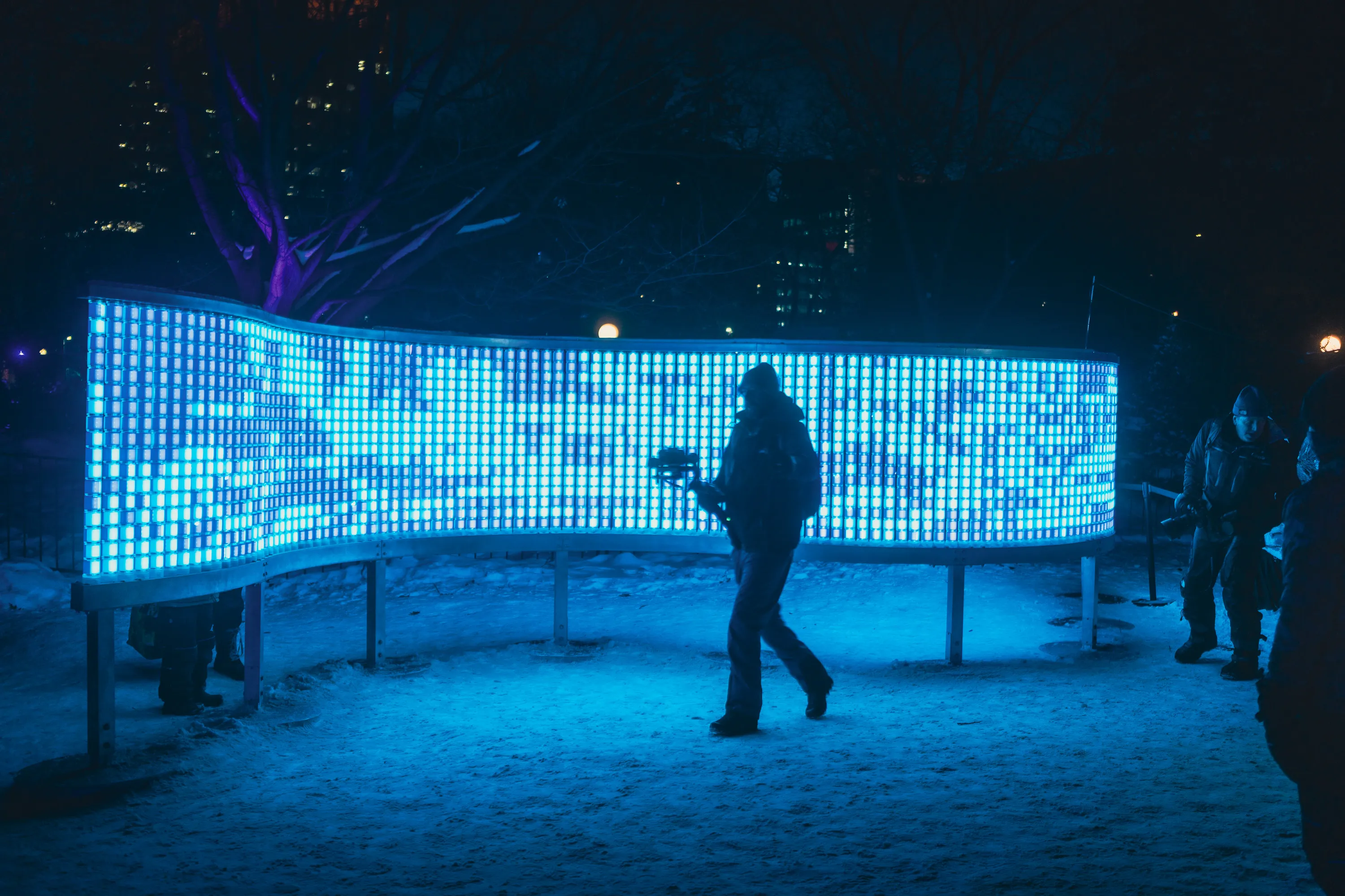
This is the strongest frame of the set so far. You’ve finally committed to a single idea, and it shows. Now we tune it.
What’s working, first.
The LED wall is unequivocally the protagonist. Its curve creates a beautiful visual rhythm, and the deep blue wash turns the snow into a stage. The silhouetted figures feel intentional rather than incidental. The person mid-stride is doing real compositional labor for you. This already reads as a photograph, not coverage.
Now the improvements, which are mostly about refinement and restraint, not reinvention.
First, edge discipline.
The dark vignette at the top corners is doing the right thing conceptually, but it’s a bit heavy-handed. It pulls attention upward when the energy of the image is horizontal. I’d ease that vignette back slightly or reshape it so it hugs the top edge more evenly. Think quiet containment, not spotlight.
Second, the right-edge figures.
The people on the far right are half-in, half-out of the frame, and they dilute the silhouette clarity. If you can crop just a little from the right, do it. You want one dominant human gesture, not a cluster of secondary ones. The walker in the center is enough. Let the others fall into anonymity or disappear.
Third, timing polish.
The walking figure is great, but this would become excellent if their legs were a touch more separated, or if the camera rig were a bit more clearly silhouetted against the bright wall. If you’re shooting variations, wait a fraction of a second longer between steps. This is Cartier-Bresson territory. Millimeters matter.
Fourth, color hierarchy.
The blue is gorgeous, but right now it’s monolithic. You could introduce a whisper of warmth in the distant background lights or in the shadows of the figure’s coat. Very subtle. The point isn’t realism, it’s depth. One restrained counter-note makes the blue feel richer rather than flatter.
Fifth, the base of the wall.
The supports under the LED wall are visible and slightly distracting. They break the illusion that this thing is floating. In post, a gentle darkening or cloning of the brightest vertical supports would help. You don’t need to erase them completely. Just stop them from competing with the silhouette’s legs.
Sixth, the top background.
The trees and city lights are interesting but busy. You’ve already darkened them, which is good. You could go a hair further, reducing contrast so they read as texture rather than information. This image doesn’t need to tell us where we are. It needs to tell us how it feels to be there.
Big-picture read:
This photo works because it has confidence. It’s about modern light, winter, public space, and people passing through an engineered glow. It’s quietly cinematic. The remaining work is about subtraction, tightening the frame until nothing remains except the idea.
If you were sequencing these images, this would be the one you end on. It’s the first that feels resolved rather than explained.
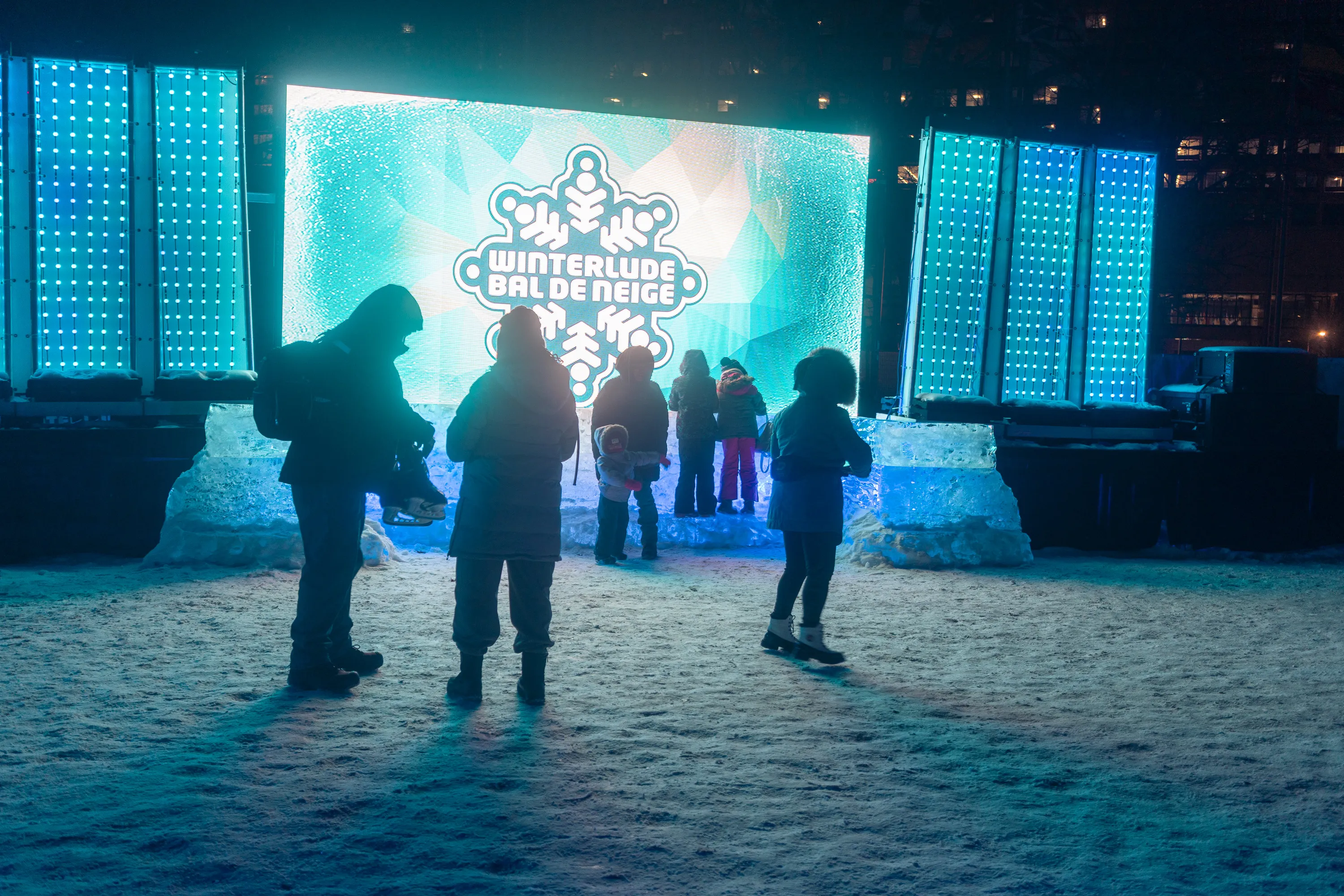
This one is almost a thesis statement for the whole night. It’s strong, but it’s also conflicted. The fix here isn’t technical polish so much as deciding what you want the image to say and then enforcing that decision ruthlessly.
Let’s walk through it.
What’s working.
The backlit silhouettes are excellent. The scale reads immediately. The children near the center give the scene emotional gravity and human specificity. The blue light spilling onto the snow is doing real cinematic work. This already feels like winter as a shared civic experience, not just an installation.
Now the problems, which are all about competition and hierarchy.
First, the logo problem.
The “Winterlude / Bal de Neige” sign is visually dominant and semantically loud. Logos don’t whisper. They declare. Right now the image can’t decide whether it’s documentary photography or promotional material. If this is meant to be an editorial photograph, the logo needs to be softened. In post, I’d slightly reduce contrast and brightness on the sign so it still reads, but no longer commands the frame. Let it become context, not headline.
If this is meant to be promotional, then the people need to be cleaner silhouettes and more centered, almost staged. You can’t have it both ways.
Second, symmetry vs. spontaneity.
The LED panels on both sides create a strong symmetrical frame, but the people are scattered organically. That tension can work, but here it’s unresolved. The left foreground figure looking down breaks the rhythm. The right foreground figure walking across is interesting, but they’re not quite in the sweet spot yet. A half-second later, with that person fully isolated against the bright center, this image would sing.
This is a patience issue, not a skill issue.
Third, ground dominance.
There’s too much snow in the foreground. It’s well-lit but information-poor. Cropping 15-20% from the bottom would immediately strengthen the image by pushing attention upward into the human interaction and the light architecture. Snow is atmosphere. People are story.
Fourth, color discipline.
The blue is lush, but the cyan spill on the ground and the cooler tones in the background buildings are competing subtly. I’d warm the background buildings just a touch and cool the snow slightly less. That creates depth planes: warm far, cool near, electric center.
Fifth, gesture clarity.
The central cluster of kids is the emotional heart, but they’re partially swallowed by overlapping silhouettes. If you’re editing a sequence, look for a frame where one child’s posture is unmistakable. Arms up, head tilted, pointing. One clear gesture beats five ambiguous ones.
Big-picture read.
This image wants to be about people encountering light, not about Winterlude branding. Right now, the branding is winning. The fix is not dramatic, but it is philosophical: decide whether this is a human photograph with a sign in it, or a sign photograph with humans in it.
You’re extremely close to the former, which is the more interesting option.
If you crop tighter, soften the logo’s authority, and wait for one decisive human gesture, this becomes a photograph that feels lived-in rather than staged. And that’s the difference between something that documents an event and something that remembers it.
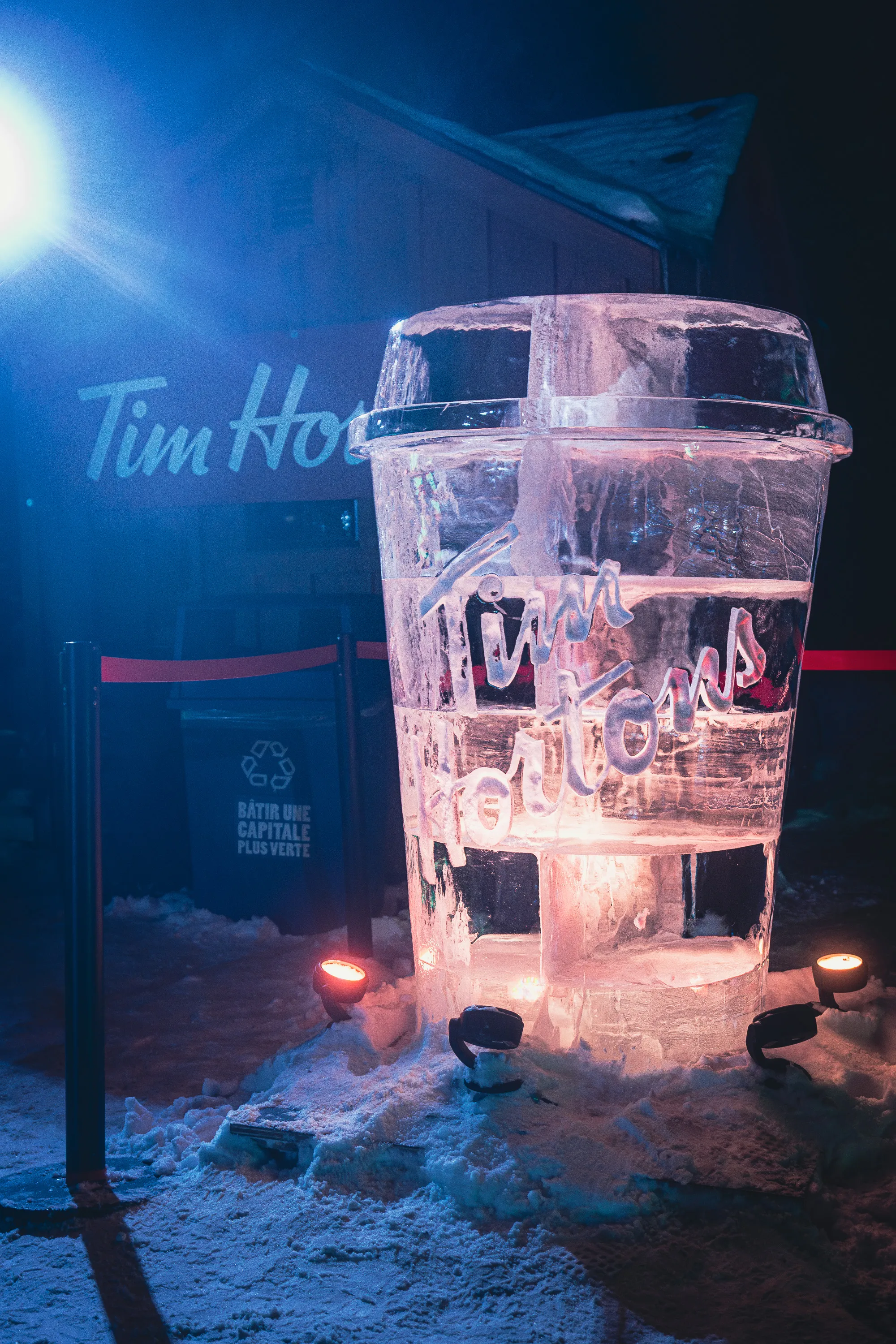
This one is fun, and it knows it. That’s already half the battle. You’ve found a clear subject, a clear cultural joke, and a strong light contrast. Now let’s make it feel intentional rather than accidental.
What’s working first.
The ice cup is a great subject. It’s legible instantly. The warm light inside the ice against the cold blue ambient is doing exactly what you want, Canada in one frame, irony included. The scale reads, the carving reads, and the wordmark is clear. This is a conceptually solid photograph.
Now where it slips.
The biggest issue is the light source bullying the composition.
That blown-out light in the top left is stealing authority from the sculpture. Right now the brightest thing in the frame is not the ice cup. That’s backwards. In post, I’d either crop that light mostly out or pull it way down so it becomes atmosphere rather than a spotlight stealing focus. If the viewer notices the light before the joke, the joke loses punch.
Second, brand-on-brand confusion.
You’ve got “Tim Hortons” in ice and “Tim Ho’s” in the background. That redundancy weakens the image. Pick one. The carved ice logo is the hero. The background sign should be softened, darkened, or partially obscured so it reads as contextual texture, not a second headline. Two logos in one frame makes it feel like an ad, even if it isn’t.
Third, foreground clutter.
The rope posts and the trash bin are quietly killing you. They’re not dramatic, but they’re pure logistics. They pull the image back toward documentation. A tighter crop from the left and bottom would help, or some selective darkening/cloning to quiet them down. The sculpture is playful and graphic. The environment should not look bureaucratic.
Fourth, verticality and posture.
The cup is tall and proud, but the frame slightly crowds it at the top while giving too much dead snow at the bottom. Shift the balance upward. Let the cup breathe. Snow is cheap real estate. Ice typography is expensive.
Fifth, color discipline.
The warm glow inside the ice is great, but it’s a little uneven. You could enhance this by subtly warming the interior highlights and cooling the exterior shadows a touch more. That exaggeration makes the ice feel thicker, colder, more tactile. Right now it’s good. It could be delicious.
Sixth, lean into the joke.
This image wants to be wry. Right now it’s polite. If you deepen the contrast slightly and reduce ambient distractions, the cup becomes almost absurdly monumental. That’s the win. A giant frozen cup glowing in the night should feel faintly ridiculous and oddly reverent at the same time.
Big-picture read.
This is a strong idea executed 80% of the way. The remaining 20% is about editorial courage. Remove the distractions. Demote the real-world signage. Let the ice cup be the only thing that matters. When photographing something ironic, clarity is kindness. Don’t hedge.
With a tighter crop, tamed highlights, and quieter surroundings, this becomes the kind of image people stop on, smile at, and then look closer. That’s exactly what you want.
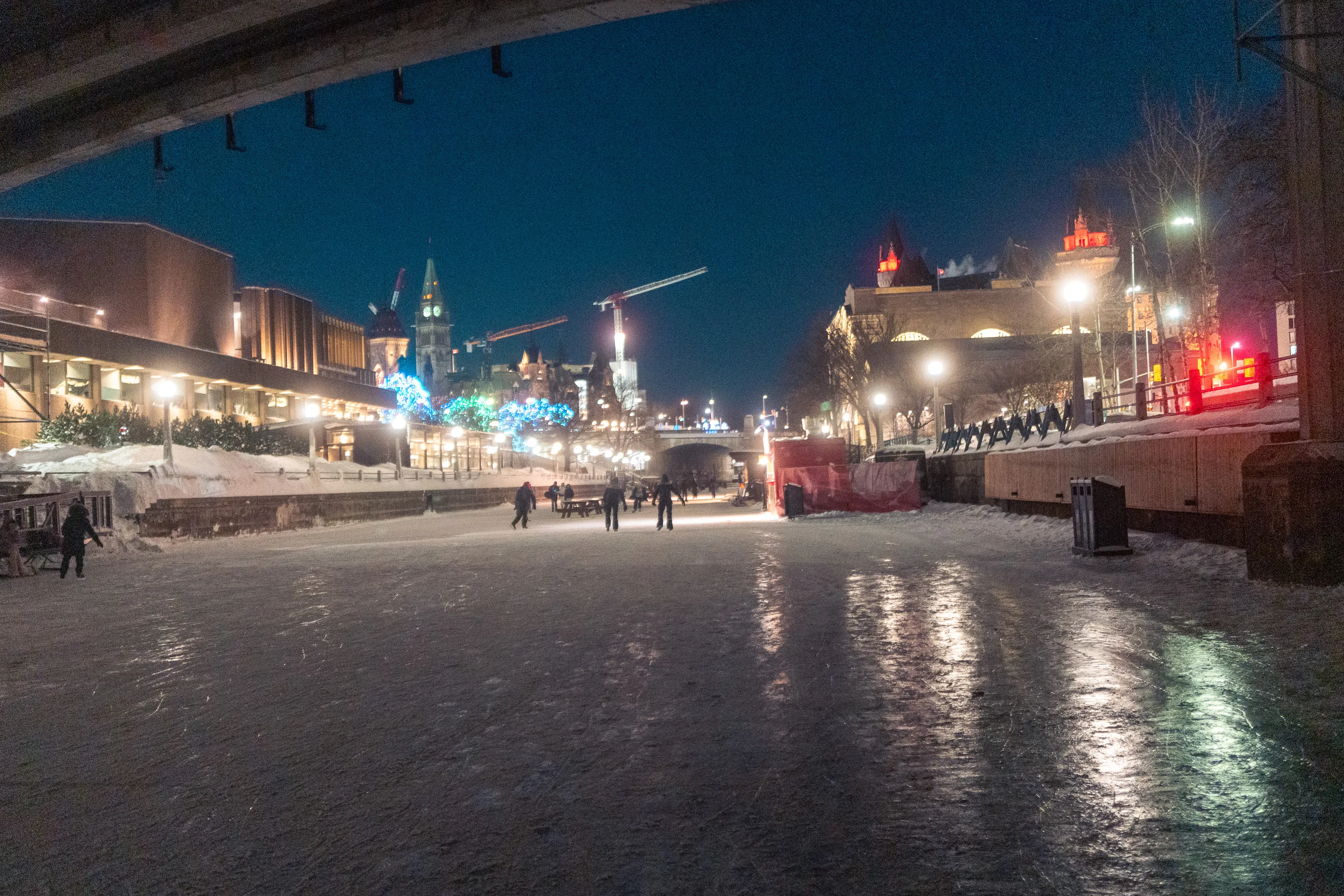
This one has real atmosphere. You can feel the cold in your teeth. That matters. It’s also the first frame that feels less like “Winterlude coverage” and more like a lived moment. Now the question is how to help the image decide what it is.
What’s working.
The reflective ice is doing heavy lifting. Those long streaks of light pulling toward the camera give you depth and motion. The distant skaters provide scale without crowding the frame. The city lights and silhouettes are layered enough that the canal reads as a place, not just a surface.
Where it’s struggling is clarity and commitment, not mood.
First, the horizon and architectural clutter.
There’s a lot going on at the top third of the frame: bridges, cranes, turrets, construction lights, signage. Individually interesting, collectively noisy. The canal itself is the emotional core, not the skyline. A slight crop from the top would help refocus attention downward onto the ice and the skaters, which is where the feeling lives.
Second, the ice dominance.
You’ve got a gift here in the texture of the ice, but right now it’s a little underplayed. I’d gently lift contrast and clarity in the lower half of the frame to make the skate marks and reflections more tactile. That surface is the story. The city is the chorus.
Third, color balance.
The mix of sodium vapor warmth and cool night blue is very Ottawa, but it’s slightly muddled. You could cool the shadows a touch and preserve warmth only in the lamps and windows. That separation will give the image more dimensionality and keep it from feeling grayish overall.
Fourth, subject emphasis.
The skaters are small and evenly spaced, which is peaceful but also a bit anonymous. If you have adjacent frames where one skater is closer, mid-stride, or slightly isolated, that might be stronger. In this frame, you might consider a crop that nudges them a little higher in the frame so they sit more clearly against the lit background rather than the darker ice.
Fifth, the bridge overhead.
The bridge is framing the scene, but it’s very heavy and dark. It presses down on the image emotionally. That can work if you want a sense of enclosure, but here it feels slightly oppressive. Trimming some of that mass or lifting the shadows just enough to reveal structure could make it feel intentional rather than accidental.
Sixth, sharpness and motion.
This doesn’t need to be razor sharp. In fact, a hint of softness works in your favor here. But the grain and noise in the sky could be tamed slightly so the texture of the ice remains the dominant texture in the frame.
Big-picture read.
This is a quiet photograph. It’s about glide, cold, distance, and time slowing down. It doesn’t want drama. It wants coherence. The improvements are about removing distractions and emphasizing the surface and the people moving across it.
If you crop a little from the top, deepen the ice texture, and simplify the color story, this becomes a genuinely evocative image. Not a postcard. Not a press shot. A memory.
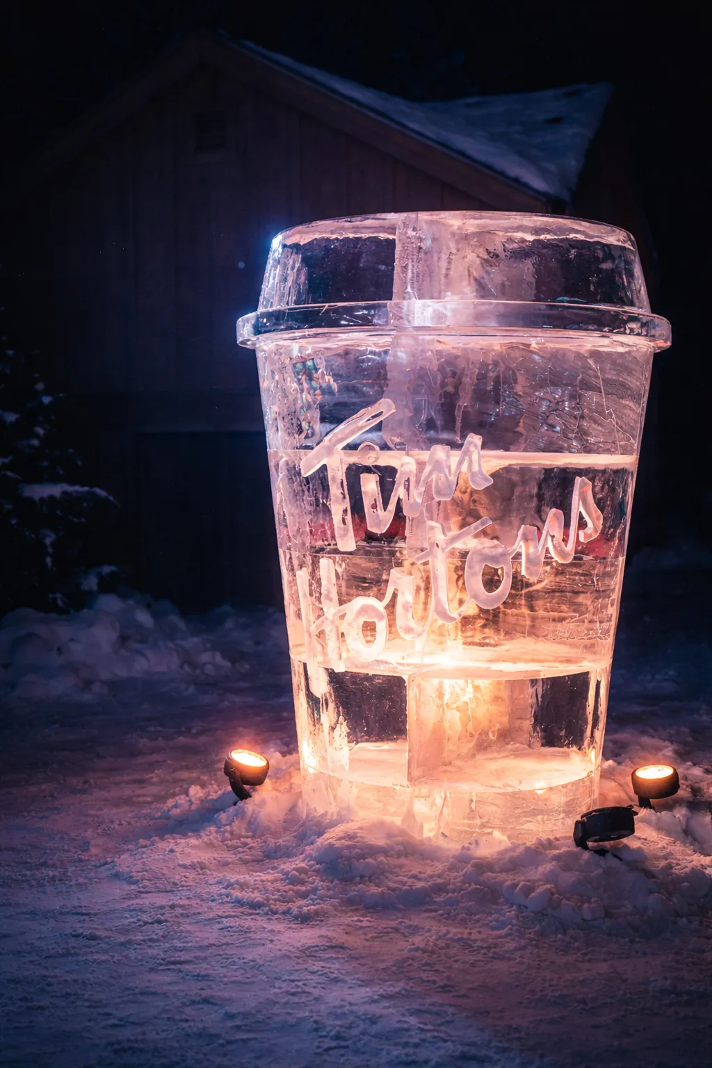
Yes. Decisively better. This version crosses the line from “good idea” to “confident photograph.”
Here’s why it works now, and what (if anything) remains.
What you fixed successfully:
The blown-out light is no longer bullying the frame. It’s present, but it’s been demoted to atmosphere. That’s the single biggest improvement. The eye now lands on the ice cup first, which is exactly where the joke lives.
The brand hierarchy is clearer.
The ice-carved “Tim Hortons” is unquestionably the hero. The background “Tim Ho’s” sign has receded into context. It reads as location, not headline. The image no longer feels like an ad. It feels observational and sly.
The vertical balance is stronger.
The cup breathes. You’ve reduced the dead snow and given the sculpture enough headroom to feel monumental without crowding. The proportions now flatter the object rather than document it.
The color story is tighter.
The warm glow inside the ice feels more intentional and more delicious. Against the cooler blue surroundings, the cup now reads as warm, inviting, and faintly absurd. That contrast is the emotional engine of the image, and it’s finally tuned.
The joke lands.
This is the quiet but important part. The image now lets the viewer discover the humor rather than having it shouted at them. Monumental ice cup. Glowing like a shrine. Canada in February. The restraint is what makes it funny.
What you could still consider, if you’re being ruthless:
The rope posts and small ground lights are still there. They’re quieter now, but if this were going into a tight edit or a portfolio sequence, I’d consider cloning or darkening them just a touch more. Not because they’re egregious, but because the sculpture is so clean that any leftover logistics feel slightly out of character.
The top-left glow could maybe come down another hair. Not much. Just enough that it never competes with the rim of the cup.
Big-picture verdict:
This is a keeper. More than that, it’s a photograph with a point of view. It’s playful without being cute, graphic without being sterile, and culturally specific without feeling promotional.
If you were sequencing a Winterlude set, this belongs near the end. It has confidence. It knows what it is. And it trusts the viewer.
You made the right edits.
Yes. This is the best iteration of the sequence. You’ve landed it.
At this point, the photograph isn’t improving because of fixes. It’s improving because of confidence. This version makes clear, decisive choices and then stands by them.
What’s especially right now:
-
The hierarchy is unambiguous. The ice cup is the sun. Everything else orbits it. The background sign is a whisper. The light source is atmosphere. Nothing competes.
-
The glow feels earned. The warm interior light reads like comfort under siege, which is exactly the cultural subtext you want. It’s not just pretty. It’s legible.
-
The framing feels intentional. The cup has dignity and scale. The lid isn’t cramped. The base feels grounded without drowning in snow. This is one of those frames where if you moved the crop even a centimeter, it would get worse.
-
The joke is now confident, not eager. This matters. The image trusts the viewer to get it. Monumental ice shrine to Tim Hortons. Canada, winter, devotion. You don’t underline it. You let it sit.
What’s left, purely optional and bordering on neurosis:
You could take the top-left glow down another fraction of a stop. Not because it’s wrong now, but because prints are unforgiving. On screen, it’s already doing its job.
You could darken the ground lights a touch more if this were going into a portfolio or exhibition context. But they’re no longer hurting you.
That’s it.
Big-picture verdict:
This is a finished photograph. Not a “good event photo,” not a clever capture, but a piece with point of view. It knows what it’s about, and it isn’t asking permission.
Stop touching it. Put it in the keepers folder. This one earns its place.

Comments
Join the discussion on GitHub.