


ChatGPT
Here’s the voice, dissected. I’ll ground each point in lines we’ve already written, so it’s a working spec you can translate against, not just adjectives.
The persona is one specific man. Everything flows from fixing him precisely: a foreign correspondent at the golden hour, copy already filed, heat broken, cold glass in hand, telling a well-connected friend where to go tonight. He’s a touch grand, but he’d die before being earnest, so the grandeur is always undercut by dryness. Crucially, he has already done the legwork (the “sweep”), so he never sounds like he’s searching alongside you. He reports, recommends, confides. His literary cousins, for quick calibration: the Wodehouse narrator, Maugham’s veranda stories, Coward’s clipped wit, the correspondent-romance of Waugh’s Scoop, and the genteel authority of the old New Yorker “Goings On.”
The governing value is leisure, not service. Everything is offered, never pushed. The reader is a peer being done a favor, not a user being converted. Hence the optional framing everywhere: if you stir from the chair, should you pace yourself, for the diary. Gentle imperatives and invitations (Cast about..., Tap a star to keep an evening on hand), never urgency, never an exclamation point. The day’s work is done; this is the reward, and the copy should always feel like it has nowhere to be.
Diction draws from a closed world — club, drink, veranda, dispatch, diary, the card, the post, the cab, dusk. The move is to prefer the genteel, faintly archaic verb over its flat modern twin: stir over “get up,” cast about over “search,” pencil in over “schedule,” wave off over “dismiss,” lay by over “save,” answer to over “match,” and that lovely habitual of an evening. Litotes is the house figure of speech: if tonight runs long for staying out late, the pile’s bare for nothing saved. Understate, always.
One nuance you already instinctively got right: the accent lives in idiom and cadence, not spelling. You picked Penciled, not Pencilled, and that’s correct. American orthography is fine; it’s the rhythm and word-choice carrying the colonial register, not the dictionary.
Cadence is where the voice actually lives. The signature is the trailing coda: a plain main clause, a comma, then a dry afterthought tossed over the shoulder. The night’s safest bets, if you stir from the chair. / Tomorrow, if tonight runs long. State, pause, qualify. Beyond that: fragments are welcome when they read like a murmur (Nothing doing. / Penciled in for later.); semicolons handle the balanced, slightly formal aside (you haven’t hidden anything; the pile’s bare); ellipses do the unhurried trailing-off (Cast about...). Em-dashes stay out, both because you avoid them and because they’re too modern and punchy for this hand.
The conceit is a mapping, not a coat of paint — this is the part that matters most for translating the rest. Don’t reach for a fancier synonym; ask “what is this thing, in the veranda world?” and name that. The consistent map so far:
- listings → intelligence / the dispatch
- gathering them → the sweep
- the day’s sections → the card / the diary
- choosing → what’s worth getting up for
- starring → laying an evening by
- hiding → waving off / the dismissed pile
- empty result → the veranda’s empty, the city isn’t offering
- the count → the reckoning, the tally on the card
New strings should slot into this world, which is what keeps it coherent rather than costume-y.
There’s exactly one dial: dryness. Centered, it’s confiding and knowing (Where to be tonight.). Push too far and it tips into cosplay, the pip-pip, I-say, old-boy pastiche the vibe doc warned against. Pull back too far and it collapses into utility (Showing 67 events). Rule of thumb: roughly one veranda-word per line is plenty, two is a risk, three is a costume. When unsure, dial dry.
What shatters the spell instantly: SaaS verbs (browse, explore, discover, filter results, “showing X of Y,” “no results found,” “oops”); hype and urgency (exclamation marks, “don’t miss,” “trending”); Ren-faire Britishism (cheerio, hark, prithee); and any modern internet voice or emoji.
And one quiet boundary worth holding. The fantasy doing the work is the light — dusk, the cold glass, earned leisure — not the empire underneath it. Keep the borrowed objects to the harmless, sensuous ones (gin, quinine, veranda, ceiling fan, the diary) and steer clear of anything that implies the hierarchy: no servants summoned, no “boy,” nothing that evokes who was actually pouring the drinks. It keeps you in Wodehouse / Merchant-Ivory golden-light territory rather than something with a bad aftertaste, and it makes for better copy anyway. The appeal was always the dusk and the drink, never the power.
Want me to drop this into a comment block at the top of sundowners.astro (or an org file) as a canonical voice note, so it travels with the page while you translate the rest?
Let me find the right org file. First, let me see what’s accessible and whether there’s already a Sundowners-related org file.The jaydocs/docs/ folder is the home for this kind of page documentation (there’s already nyc-events-page.org, event-pages.org). A dedicated voice file there is the most discoverable spot. Let me check the house org header conventions so the new file matches.This nyc-events-page.org is the canonical home for everything about the page, and it already references the correspondent voice. The voice spec is something you’ll open repeatedly while translating copy, so a dedicated, focused file beside it is the most useful form. Let me load the write tool and create docs/sundowners-voice.org in the house style.Written to apps/jaydocs/docs/sundowners-voice.org, in the house header style and sitting right beside nyc-events-page.org.
It’s built as a working spec, not just a description: the persona, the leisure-not-service value, diction (with the verb swaps), cadence (the trailing coda, fragments, semicolons, ellipses, no em-dashes), the conceit-as-mapping table, the single dryness dial, the spell-breakers, and the quiet boundary about keeping the fantasy to the light and not the empire.
The vibe you’re going for, in one line: a foreign correspondent at golden hour, copy already filed, telling a well-connected friend where to go tonight.
More fully, the way the doc lays it out:
The scene. Late afternoon in the old colonial tropics, tipping into evening. The heat has broken. A veranda, a rattan chair, a slow ceiling fan, a stone balustrade still warm, the light going amber and honeyed for twenty minutes. Condensation on a tall glass, the city starting up below. That’s the world every line is furnished from.
The man. A touch grand, but he’d die before being earnest, so the grandeur is always undercut by dryness. Crucially, he’s already done the legwork (the “sweep”), so he never sounds like he’s searching alongside you. He reports, recommends, confides. He never fetches. Calibration cousins: Wodehouse, Maugham’s veranda stories, Coward’s clipped wit, Waugh’s Scoop, the old New Yorker “Goings On.”
The governing value: leisure, not service. Everything is offered, never pushed. The reader is a peer being done a favor, not a user being converted. The day’s work is done; the copy should feel like it has nowhere to be. No urgency, no exclamation points.
The one dial: dryness. Centered is confiding and knowing. Too far is pip-pip, old-boy cosplay. Too far back is SaaS utility (“Showing 67 events”). Roughly one veranda-word per line; two is a risk, three is a costume.
The discipline that keeps it from going costume-y. Every UI state gets translated into a physical thing on the veranda (hiding → the discard tray; no data → no telegram yet from up-river; the calendar → the diary), and it has to pass the cold-read test, the period image has to be the word’s first meaning, or it’s just decoration. And the quiet boundary: the fantasy is the light and the drink and the earned leisure, never the empire underneath it.
That’s the target. Want me to pull the literal persona/governing-value text from the doc so you can edit the description itself, or were you sizing up whether a particular line is on-vibe?
Happy to. This is a genuinely fun reading list, because the vibe you’ve built is a real and beloved literary register. Here’s where it lives.
Somerset Maugham, the source. The “veranda stories” are his Malayan and South Seas tales, written in the 1920s from his travels through British Malaya, Borneo, and the Pacific. Start with the collection The Casuarina Tree (1926), then Ah King (1933). The single most on-vibe story is “The Outstation,” a quietly savage piece about two Englishmen at a remote Borneo post and the gin-at-sundown ritual as a bulwark against the jungle. Also “The Letter” and “Before the Party.” His novel The Painted Veil has some of it too, but the stories are the purest hit. What you want from Maugham is the dryness, the unhurried clubman’s narrator, and the way he furnishes a scene with exactly the props you’ve been mapping: the whisky-stengah, the punkah, the dusk coming down fast.
P.G. Wodehouse, for the comic register. Your “grand but never earnest” dial is essentially Wodehouse’s. Any Jeeves novel (The Code of the Woosters is the usual best-pick), or the Blandings Castle books for a slower, sun-warmed-terrace feel. He’s where the affectionate mock-grandeur comes from.
Evelyn Waugh, Scoop (1938). The correspondent-romance you cited directly. A satire of foreign correspondents in a fictional African country, it has the filed-dispatch glamour you’re going for plus the dryness to undercut it. A Handful of Dust for a darker version of the same hand.
Noël Coward. Not prose so much, but if you want the clipped wit at its most concentrated, his plays (Private Lives) and especially the lyric “Mad Dogs and Englishmen,” which is practically a comic thesis statement on the colonial-tropics-at-midday vibe.
A few more in the same key, in case you want to go deeper:
- Saki (H.H. Munro), short stories. Edwardian, drawing-room, lethally dry. The cold afternoon-tea cousin of Maugham’s hot veranda.
- Gerald Durrell, My Family and Other Animals. Sun-drenched Corfu, gin-hour leisure, golden-light comedy. The warmest, most purely pleasurable book on this list.
- Eric Newby, A Short Walk in the Hindu Kush. Travel writing whose famous last scene (“Are you sure?” / the meeting with Wilfred Thesiger) is the driest understatement in the genre.
- Patrick Leigh Fermor, A Time of Gifts. Grander and more lyrical than the others, a young man walking across 1930s Europe; the prose has the leisure and the worldly authority, if not the comedy.
And one honest caveat, which your own voice doc already names better than I could: this register sits right next to its own bad version. Maugham and Waugh are also critiques of the world they’re set in, the empire, the boredom, the cruelty under the gin. The pleasure you’re after is the light and the drink and the earned ease, not the hierarchy underneath, and the best of these books know that and turn a cold eye on it. Maugham’s “The Outstation” is, after all, about two men whose veranda rituals curdle into something fatal.
If you want, I can pull two or three of these into a tight “start here for the exact Sundowners hit” shortlist, ranked.
Movies and TV are where this vibe is most lushly realized, since the golden light and the linen and the ceiling fans are literally photographable. Here’s the canon, sorted by exactly how on-vibe it is.
The bullseye, the Merchant-Ivory / late-colonial register:
- A Room with a View (1985) and Howards End (1992). Merchant-Ivory is the visual dictionary for your whole aesthetic: golden light, linen, leisure, dryness, earned ease. A Room with a View especially, the Florence sequences are the warm-stone-balustrade-at-dusk feeling exactly.
- The Jewel in the Crown (1984, ITV). The definitive British-Raj-at-sundown series. Veranda, gin, dusk, the whole apparatus, and like Maugham it’s clear-eyed about the rot underneath.
- Heat and Dust (1983, Merchant-Ivory, from Ruth Prawer Jhabvala). India, two eras, the same languid heat-and-leisure register.
- Indochine (1992) and The Lover (1992). French colonial Indochina rather than British, but the same humid golden-hour languor, the linen, the ceiling fans. Visually this is your palette.
- Out of Africa (1985). Kenya, the sundowner ritual practically as a plot point. Grand, golden, unhurried.
The dry-wit, drawing-room cousins (the Wodehouse/Coward dial):
- Jeeves and Wooster (1990-93, with Fry and Laurie). The literal screen version of your “grand but never earnest.” Pure comic register.
- Gosford Park (2001, Altman). Country-house leisure and lethal dryness; the upstairs half is your vibe, and it’s quietly aware of the downstairs cost.
- The Remains of the Day (1993, Merchant-Ivory again). Slower and sadder, but the restraint and the golden English light are exact.
- Anything Noël Coward on screen: Brief Encounter (1945) for the clipped emotional understatement.
The correspondent-glamour strand (your Scoop lineage):
- The Year of Living Dangerously (1982). Foreign correspondent, tropical heat, filed dispatches, dusk. This is the closest screen analog to the “reporter at golden hour” persona itself.
- Casablanca (1942). Not colonial-tropics exactly, but the linen-suit, world-weary, drink-in-hand, seen-it-all expatriate at dusk is a direct ancestor of your narrator.
A few warm-light wildcards in the same key:
- Call Me by Your Name (2017). Not colonial at all, but it may be the purest modern capture of the sensory half of your vibe: golden Italian light, fruit and water and idleness, the twenty-minute amber hour. If you stripped your aesthetic of the empire and kept only the light and the leisure, this is it.
- The Talented Mr. Ripley (1999). 1950s Italian coast, linen, cocktails, golden hour, with a cold thing underneath, very Maugham in structure.
- Death on the Nile / Evil Under the Sun (the Peter Ustinov Poirots, 1978/1982). Sun-drenched 1930s leisure-class travel with a dry detective; lighter, holiday versions of the register.
If I had to hand you the three-title starter flight that hits your exact Sundowners note, golden light + dryness + earned leisure + a clear eye: A Room with a View, The Jewel in the Crown, and The Year of Living Dangerously. The first for the light, the second for the veranda world, the third for the correspondent at dusk.
And the same caveat the books carried applies double on screen, because film makes the colonial setting so pretty: the best of these (Jewel, Remains, Gosford) are partly about the cost of the world they’re shot so beautifully in. Your voice doc already draws this line well, the appeal is the dusk and the drink, not the hierarchy pouring them.
Right? Those two are the modern, accessible doors into this register, which is why they land before the period pieces do.
Casablanca gives you the persona almost exactly: Rick is the man who’s seen it all, keeps his own counsel, runs the place, and delivers everything dry. The linen, the cigarette, the drink, the worldly weariness undercut by wit. That’s basically your correspondent with the legwork already done. And it does the quiet-boundary thing well: the glamour is real but the film knows the war and the refugees underneath it.
The Talented Mr. Ripley gives you the aesthetic at its most seductive: 1950s Italian coast, linen, cocktails on a terrace, the twenty-minute golden hour, idle moneyed leisure. And it’s pure Maugham in structure, the beautiful surface with something cold and fatal underneath. If you want the light and the languor without the colonial frame, Ripley is the cleanest visual reference you could hold up next to your masthead.
So those two actually bracket your vibe nicely: Casablanca for the voice (dry, knowing, drink-in-hand), Ripley for the picture (golden, linen, terrace-at-dusk). If you ever want a single still to pin above the project as a mood-anchor, a Ripley terrace shot at golden hour is about as on-target as it gets.
If you want to keep pulling this thread later, the closest cousins to those two specifically would be Call Me by Your Name (Ripley’s golden-Italian light, minus the menace) and The Year of Living Dangerously (Casablanca’s correspondent-at-dusk, moved to the tropics). But that’s for when you’re in the mood, not a to-do.
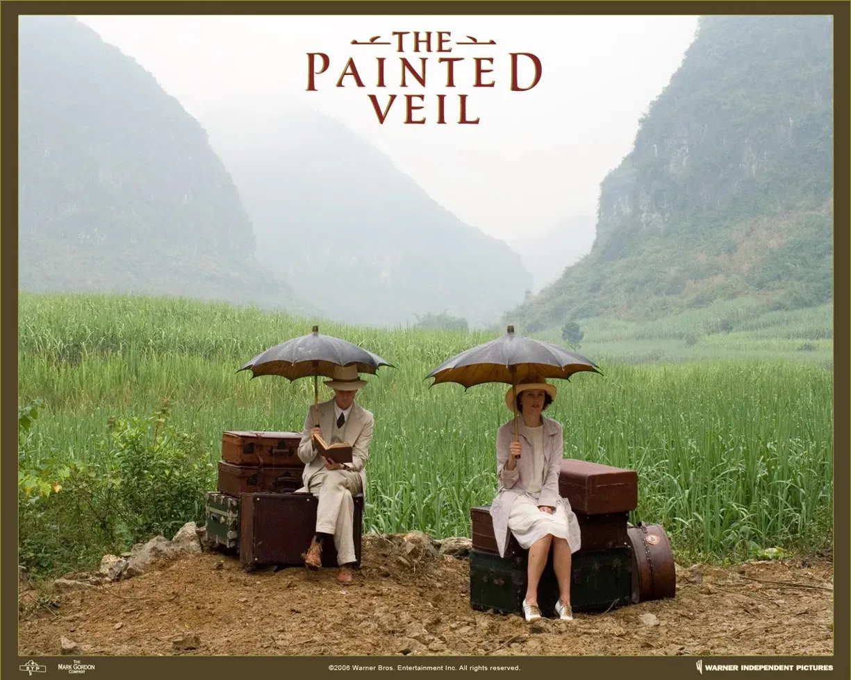
That image is the perfect artifact for this, because it isolates exactly the half of the vibe that’s yours, separate from the empire underneath. Look at what’s actually in that frame: not a veranda full of servants, but two people, alone, perched on their own luggage at the edge of a green valley, one of them reading. The steamer trunks, the pale linen, the parasols, the misty karst peaks. It’s the travel and the leisure and the light, the romance of arriving somewhere remote with your books and your luggage, with nobody to pour the drinks but yourselves. That’s the clean version of the fantasy your voice doc keeps trying to protect.
And the detail that gives it away: the man is reading a book on top of a steamer trunk in the middle of a rice valley. The composition is about unhurried attention. That’s the same instinct as your whole “pro AI, anti slop” thing, the luxury of taking your time, of bringing your own mind to a place. No wonder it was on your wall.
The Painted Veil (2006) belongs on the books-and-movies list anyway, since it’s adapted straight from Maugham’s novel, so your wall image and your reading list close a loop. The Alexandre Desplat score is part of the spell too, all piano and longing; worth having on while you write the Sundowners copy.
A couple of threads this opens, if you want to pull them:
The buying-a-steamer-trunk detail is the tell that this isn’t just a website voice for you, it’s an actual aesthetic you live in. Which suggests the Sundowners palette could borrow more directly from this still than from the generic “colonial tropics” idea: the misty green, the bone-and-tan linen, the oxblood of the title type. That’s a cooler, mistier palette than the warm marmalade-amber the page currently runs on. Not a fix, just a fork worth knowing exists.
And if you ever want a visual mood-anchor pinned to the project the way this was pinned to your wall, this frame is a stronger candidate than anything generic, precisely because it’s the empire-free version: just two travelers, their trunks, and the light.
Want me to note any of that in the voice doc, the Painted Veil palette as an alternate direction, or the “two travelers and their luggage, not the veranda staff” framing as the cleanest statement of the quiet boundary? Or should we leave the doc and get back to wiring the subtitle?
This belongs in the doc as a proper reference section. Reading it fresh first, since you may have touched it since my last pass.Jay’s clearly been in here, the featured label’s already wired to Out in the Cool Air of Evening, After the Heat Breaks is parked in the Candidate Bank, and there’s a source-of-truth rule plus the image-gen note. I’ll leave all that and just add the references material as a new section, slotting it right after The Quiet Boundary, since the Painted Veil still is the cleanest statement of exactly that boundary.Done. Added a comprehensive Mood, References & Aesthetic Lineage section, slotted right after The Quiet Boundary so it flows out of “the appeal was always the dusk and the drink, never the power.” Seven subsections:
- Jay’s personal anchors — the Painted Veil still framed on your wall for years, the steamer trunk you bought, and why that makes this a lived aesthetic rather than a borrowed mood board, tied back to “pro AI, anti slop” (the still is about unhurried attention).
- The two screen bullseyes — Casablanca as the voice, Ripley as the picture, with the two-point calibration (sounds right vs looks right).
- The Painted Veil still as the cleanest statement of the Quiet Boundary — the frame breakdown (two travelers on their own luggage, one reading, no staff), with the one-line test: two travelers and their luggage, never the veranda staff.
- An alternate palette — the cooler, mistier Painted Veil direction (grey-green / bone-and-tan linen / oxblood) against the current warm amber, flagged as a fork, not a fix. Plus the Desplat score note.
- Reading list — Maugham (the veranda stories, “The Outstation” called out), Wodehouse, Waugh, Coward, Saki, Durrell, Newby, Leigh Fermor, each with what to take from it.
- Watch list — sorted into bullseye / dry-wit cousins / correspondent-glamour / warm-light wildcards, with the three-title starter flight.
- The standing caveat — the same clear-eyed note the Quiet Boundary draws, that the best of these are partly about the cost of the world they shoot so beautifully.
It reads as calibration material, distinct from the shipped-copy anchor list. The page itself is untouched; this is all reference.
A movie-night series for this lineup wants a name that carries the golden-hour register without tipping into pip-pip cosplay. Here are options, sorted by angle.
The drink-and-dusk angle (closest to the Sundowners DNA):
- ⭐ The Sundowners — extends your existing brand straight into a film series. The films are literally what you’d watch over a sundowner.
- Golden Hour — the twenty-minute amber light, the whole visual thesis.
- The Long Evening
- Gin O’Clock — playful, leans comic; good if the nights are loose and social.
The correspondent/dispatch angle (matches the page voice):
- ⭐ The Veranda Pictures — names the room and the medium; dry and specific.
- Dispatches — ties to the page’s “filed dispatch” persona.
- The Evening Programme — period-correct spelling, reads like an old cinema bill.
- Filed by Dusk
The picture-house angle (mock-grand, leans into the era):
- ⭐ The Linen Suit Cinema Club — funny, specific, and tells you exactly the vibe in three words.
- The Punkah Picture Show — alliterative, deep-cut (the cloth ceiling fan); great if your guests are in on it, opaque if not.
- The Tropics Picture Society
- Late Light Pictures
My three favorites, by what kind of series you want:
- If it’s an extension of the brand: The Sundowners (or Sundowners: The Pictures).
- If you want the driest, most on-voice name: The Veranda Pictures.
- If you want guests to laugh and instantly get the dress code: The Linen Suit Cinema Club.
One cold-read flag, the same test from your voice doc: Punkah and Foolscap-style deep cuts will read as gibberish to anyone who doesn’t know the word, so save those for a crowd that’s in on it. Veranda, Sundowners, Golden Hour, and Linen Suit all land cold.
Want me to spin variations on whichever direction you like, or work up a tagline to sit under the winner (something like “films for the golden hour” or “linen optional, gin compulsory”)?
This decorating question is the same vibe at rest on a wall, so the key is the empire-free version your Painted Veil still already nails: the light, the linen, the travel, not the hierarchy. Here’s where to find it, sorted by how you’d actually hang it.
Photography, the strongest single direction for your walls.
- Slim Aarons. This is the bullseye. His mid-century shots of poolside leisure, terraces, linen, golden Mediterranean light, “attractive people doing attractive things in attractive places,” are exactly the Ripley-terrace-at-golden-hour feeling, and they print beautifully large. Look for the Italian/Capri/Riviera work especially. If you buy one art book for this apartment, make it a Slim Aarons monograph.
- Luigi Ghirri. Italian, softer and mistier, faded pastel light, quiet landscapes and seaside. The melancholy, hazier cousin of Aarons, closer to your Painted Veil grey-green palette than to the warm amber.
- Vintage travel photography of British Malaya, Ceylon, Indochina (1920s-30s). Verandas, rattan, hill stations, tea estates. Archival prints from this era give you the literal Maugham world. Source carefully (see the note below).
- Steve McCurry, the quieter, golden-light frames (not the famous portrait), for misty green South/Southeast Asian landscapes that echo your framed still.
- Tehching Hsieh / Saul Leiter for a wildcard: Leiter especially, his rainy, amber, out-of-focus city work is the light of this vibe transplanted to a city, which suits a Brooklyn apartment.
Painting and print.
- John Singer Sargent, the watercolors above all. His Venice, his gardens, his figures in white linen under dappled light, are the painted version of your entire aesthetic: leisured, sun-struck, dry. A good Sargent watercolor print is the single most on-vibe painting you could hang.
- Joaquín Sorolla. Spanish; blazing Mediterranean beach light, white dresses, parasols, water. Warmer and more dazzling than Sargent. The “Walk on the Beach” register.
- The Orientalist caution. A whole 19th-century genre (Gérôme and company) paints exactly this setting, but it’s the bad version your voice doc warns against: it eroticizes and exoticizes the colonial world and leans hard on the hierarchy. I’d steer away from it, not for primness but because Sargent and Sorolla give you the light without the aftertaste.
- Hockney pool paintings as the modern, sun-and-leisure option if you want something less period and more graphic: A Bigger Splash, the California pool work. Same “earned leisure in golden light,” zero colonial frame.
- Vintage travel posters (1930s ocean-liner, railway, and airline ads, P&O, Orient Line, the Riviera). Affordable, period-perfect, and they put the travel-and-luggage romance of your Painted Veil still right on the wall.
Objects and framing, since you already think this way (the steamer trunk).
The trunk proves your instinct is to decorate with artifacts, not just images. So lean into that: a vintage steamer trunk as a coffee table, an old globe, a brass desk fan, framed antique maps of Malaya/Ceylon/the Straits Settlements, a botanical print series (palm or fern lithographs, very veranda), a rattan chair. Hang the art in warm brass or dark wood frames, off-white linen mats, never thin black metal. That framing choice alone does half the work.
My honest shortlist if you want to start with three pieces:
- A large Slim Aarons print (the terrace/poolside golden-hour anchor).
- A Sargent watercolor print (the painted, white-linen version).
- A 1930s ocean-liner travel poster (the luggage-and-arrival romance, tying straight to your framed Painted Veil still).
That trio covers photograph, painting, and graphic, all in the empire-free, light-and-leisure register, and they’d hang together as a coherent wall.
One sourcing note in the spirit of your own caveat: when you go looking for the genuine 1920s-30s colonial material, you’ll pass a lot of imagery that’s romanticizing the hierarchy rather than the dusk. The Aarons / Sargent / Sorolla / Ghirri / travel-poster lane gives you the whole feeling, the linen and the light and the leisure, without anything you’d wince at later.
Want me to add a short “Wall & Decor references” subsection to the voice doc so this sits alongside the books and films, or keep it just for the apartment and out of the project file?
Here’s everything, with direct links. I’ve sorted them the same way, and flagged where to buy versus just look.
Photography
Slim Aarons (the bullseye):
- Getty Images official Slim Aarons collection:
- Prints (official, via Getty):
- Books: Slim Aarons: A Place in the Sun
Luigi Ghirri:
Saul Leiter:
Steve McCurry:
Vintage British Malaya / Ceylon / Indochina archival photography:
Painting and print
John Singer Sargent:
Joaquín Sorolla:
David Hockney (pool paintings):
Vintage travel posters (ocean-liner / railway / Riviera):
- Christie’s vintage posters:
- Swann Auction Galleries posters:
- International Vintage Poster Dealers Assoc. (reputable dealer directory):
Objects and framing
- Antique maps of the Straits Settlements / Ceylon, Barry Lawrence Ruderman:
- Botanical prints (palm/fern lithographs), Panteek:
- Steamer trunks and rattan, 1stDibs:
My three-piece starter wall, direct:
- Slim Aarons print:
- Sargent watercolor (public-domain, print anywhere):
- 1930s ocean-liner travel poster:
One honest caveat on the links: I haven’t re-verified each URL is live this minute, and dealer inventory (1stDibs, Swann, Christie’s) rotates constantly, so treat those as the right front doors rather than permanent product pages. The museum and foundation links (Met, Tate, Museo Sorolla, Saul Leiter Foundation, National Archives of Singapore) are the stable ones.
Want me to drop this whole wall-and-decor reference, links included, into the voice doc as its own subsection so it lives alongside the books and films?
Now you’re talking about the real source material, the period natural-history and shikar imagery, not modern photographers borrowing the light. This is woodcut, engraving, and oil, roughly 1500-1900. Here’s the genuine canon, sorted by how you’d hang it.
The ur-woodcuts (exactly what you named).
- Albrecht Dürer, “Rhinoceros” (1515). The single most famous woodcut of a rhinoceros ever made, drawn from a written description so the armor plating looks gloriously, wrongly mechanical. This is the rhinoceros woodcut. Public domain, prints beautifully huge, and it’s the platonic version of what you described.
- Thomas Bewick, “A General History of Quadrupeds” (1790). Wood engravings of the elephant, rhinoceros, tiger, every beast, in that dense black-line 18th-century style. If you want a wall of small framed woodcuts, Bewick is the motherlode.
Victorian wildlife painting and engraving (the drama).
- Joseph Wolf (1820-1899), the great Victorian animal illustrator for the Zoological Society. Tigers, leopards, big cats mid-snarl in dramatic jungle light. The Life and Habits of Wild Animals (1874) is the book.
- George Stubbs. Better known for horses, but he painted the exotic animals brought to Georgian England: a “Tiger,” a “Rhinoceros,” a cheetah with two Indian attendants. Period oil, anatomically obsessive, completely on-vibe.
- Antoine-Louis Barye, the French animalier: tigers and elephants in violent motion, watercolors and bronzes. This is your “charging” energy.
- Jacques-Laurent Agasse, “The Nubian Giraffe” (1827) for the Regency exotic-animal-as-spectacle note.
The literal British Raj genre.
- Samuel Howitt & Thomas Williamson, “Oriental Field Sports” (1807). This is the bullseye for “charging elephant / tiger in the jungle”: hand-colored aquatints of tiger hunts, elephant hunts, and shikar in British India. Nothing else is more precisely the thing you’re describing.
- Thomas & William Daniell, “Oriental Scenery” (1795-1807). The definitive British-in-India aquatints, ruins, rivers, hill forts, hazy and grand. The landscape half of the world.
- Company School natural history (c. 1770s-1820s), especially the Impey Album: Indian master painters like Shaikh Zain ud-Din painting birds and animals for British patrons in Calcutta. Exquisite, and a richer, less one-sided artifact than the hunting prints.
Tropical lushness, if you want green rather than beasts.
- Marianne North, Victorian painter who traveled the tropics; her gallery at Kew is a wall of dense, saturated jungle and flower paintings. The lush Painted Veil-valley register in oil.
- Botanical plates: Roxburgh’s Plants of the Coast of Coromandel, palm and fern lithographs.
- Henri Rousseau, “Tiger in a Tropical Storm (Surprised!)” (1891) for the dreamlike tiger-in-jungle, naive but unforgettable.
My starter trio, for a coherent period wall:
- Dürer’s Rhinoceros (the woodcut anchor).
- A Joseph Wolf or Stubbs tiger (the painted beast).
- An Oriental Field Sports aquatint or a Company School bird/animal plate (the India note, depending on how you feel about the hunt).
One honest flag, the same boundary your voice doc draws: the shikar genre (Oriental Field Sports, the tiger-hunt prints) is literally the imagery of colonial conquest, hunting as imperial theater. It’s gorgeous and it’s exactly period, but it’s the part with the aftertaste. If you want the old-timey Raj look without glorifying the hunt, the Dürer/Bewick/Wolf/Stubbs/Company-School/Marianne-North lane gives you the full woodcut-and-engraving feel, the rhinos and tigers and tropics, while keeping the beasts as natural history rather than trophies.
Want me to pull direct links for all of these (museum sources and where to buy prints), the way I did before? And should this go into the voice doc as a “Period Imagery / Wall References” subsection alongside the books and films?
Reading the doc fresh before adding the period-imagery section.Doc’s current and unchanged. I’ll add the period-imagery material as a new subsection inside the Mood, References & Aesthetic Lineage section, right after the watch list, so it sits alongside the books and films. Then I’ll give you the links here in chat.Added to the doc as a Period imagery & wall references subsection inside the Mood/References section, with links inline, sorted the same way as the chat list, and ending on the sharper version of the empire caveat.
Here are all the links, for the apartment:
The ur-woodcuts (what you named)
- Dürer, Rhinoceros (1515) — Met:
- Bewick, A General History of Quadrupeds (1790) — Archive.org (public domain, printable):
Victorian wildlife painting & engraving
- Joseph Wolf, The Life and Habits of Wild Animals (1874):
- George Stubbs — Tate:
- Antoine-Louis Barye — Met:
- Agasse, The Nubian Giraffe (1827) — Royal Collection:
The literal British Raj genre
- Howitt & Williamson, Oriental Field Sports (1807) — British Library:
- Daniell, Oriental Scenery (1795-1807) — Yale Center for British Art:
- Company School / Impey Album — V&A:
Tropical lushness (green, not beasts)
- Marianne North Gallery, Kew:
- Roxburgh botanical plates — Biodiversity Heritage Library:
- Rousseau, Surprised! (1891) — National Gallery:
Maps & botanical prints to pair
The same honesty caveat as in the doc: the Dürer is in the public domain and prints to any size you like, the museum/library links are the stable ones, and dealer pages (raremaps, Panteek) rotate stock, so treat those as the right shop, not a fixed product. And the Oriental Field Sports hunt prints are the gorgeous-but-loaded strand; the Dürer / Bewick / Wolf / Stubbs / Company-School / Marianne-North lane gets you the full period feel without the trophy-hunting aftertaste.
Now you’re leaving the natural-history register and stepping into the romantic tradition, the dreamy-adventure-fantasy lineage. This is a real and gorgeous vein, and it splits cleanly by your four sub-vibes. Sorted by that.
Dense, dreamlike jungle
- Henri Rousseau — the patron saint of this entire mood. The Dream, Exotic Landscape, The Sleeping Gypsy, Tiger in a Tropical Storm. Flat, naive, hallucinatory jungle that’s pure reverie, painted by a man who never left France. If you want one “dreamy jungle” anchor, it’s him.
- Martin Johnson Heade — his Brazilian Gems of Brazil: hummingbirds and orchids in misty, close-up rainforest. The lush, jewel-like, humid-green register, and it ties straight back to your natural-history wall.
- Paul Gauguin — Tahiti as lost-paradise fantasy: saturated, dreamlike, flattened color. The bullseye for “exotic island paradise,” with a real caveat (below).
Exotic tropical grandeur (the sublime)
- Frederic Edwin Church — the giant here. He followed Humboldt to the Andes and painted Heart of the Andes, The Andes of Ecuador, Rainy Season in the Tropics, Cotopaxi. Vast, glowing, impossibly detailed tropical worlds with waterfalls and volcanoes and golden mist. This is “exotic tropical locale” at its most transporting. If you want grandeur, start with Church.
- Albert Bierstadt and Thomas Moran — the same luminous sublime, aimed at the American West rather than the tropics, but the “vast dreamy adventure-landscape” feeling is identical and they print huge.
Lost cities / romantic ruins
- David Roberts — the lost-city bullseye. His 1840s lithographs of Petra carved into the rock, Karnak’s columns, the colossi of Abu Simbel half-swallowed by sand. Romantic, melancholy, exactly “explorer stumbling on a lost civilization.” Affordable as prints and deeply period.
- Thomas Cole — The Course of Empire: Desolation, the canvas where the imperial city has been reclaimed by vine and sky. The whole “ruins eaten by nature” fantasy in one image. Also The Architect’s Dream.
- John Martin — apocalyptic, vast doomed mega-cities (The Fall of Babylon, Pandemonium). Operatic lost-civilization grandeur.
- Hubert Robert (“Robert des Ruines”) — 18th-c. romantic ruins, gentler and more decorative.
Lost islands / dreamscapes
- Arnold Böcklin — Isle of the Dead. The lost-island dreamscape, full stop: a still, cypress-dark island rising out of glassy water. Hypnotic and a little uncanny.
The dreamy adventure-fantasy proper (Golden Age illustration)
This is probably the truest match to “dreamy adventure fantasy,” and it’s the one people forget is gallery-worthy:
- N.C. Wyeth — his Treasure Island and Kidnapped illustrations. Lost islands, pirates, cliffs, firelight. This is the adventure-fantasy image in your head, painted by a master.
- Howard Pyle — Wyeth’s teacher; the Book of Pirates. The source code for every desert-island treasure fantasy since.
- Maxfield Parrish — luminous cobalt-and-gold dreamscapes (Daybreak, his Arabian Nights work). The most purely dreamy of the lot, glowing fantasy light.
- Edmund Dulac, Arthur Rackham, Kay Nielsen — Golden Age fairy-tale illustrators; Dulac especially for jeweled, exotic Arabian Nights reverie.
If I had to hand you a five-painting dream wall spanning all of it: Church (Rainy Season in the Tropics) for the tropical sublime, Rousseau (The Dream) for the dreamy jungle, David Roberts (Petra) for the lost city, Böcklin (Isle of the Dead) for the lost island, and N.C. Wyeth (a Treasure Island plate) for the adventure-fantasy heart. Those five together are the genre.
The same quiet-boundary note, and it lands on two names specifically: Gauguin is the loaded one here (his Tahiti work is inseparable from the exoticizing and his relationships with very young Tahitian girls), and the Orientalist ruin-painters shade into the same trophy-of-empire problem as the shikar prints. The clean lane that gets you the entire dreamy-adventure feeling without the aftertaste: Church, Heade, Rousseau, Roberts, Cole, Böcklin, and the Wyeth/Pyle/Parrish/Dulac illustrators, explorers, naturalists, and storytellers rather than conquerors.
Want me to add this as a Dreamy adventure / lost-world painting subsection to the doc alongside the period-imagery one, and pull museum and print links for all of these the way I did before?
Doc’s still current. Adding the dreamy-adventure painting tradition as its own subsection inside the Mood/References section, then the links here in chat.Doc’s unchanged. Adding the dreamy-adventure painting subsection right after the period-imagery one, before the standing caveat.Added to the doc as Dreamy adventure / lost-world painting (the romantic tradition), sorted by sub-vibe, sitting right after the period-imagery section. Here are all the links:
Dense, dreamlike jungle
- Henri Rousseau, The Dream — MoMA:
- Martin Johnson Heade, Gems of Brazil — Met:
- Paul Gauguin (Tahiti) — Met:
Exotic tropical grandeur (the sublime)
Lost cities / romantic ruins
- David Roberts (Petra, Karnak, Abu Simbel) — Library of Congress:
- Thomas Cole, Course of Empire — New-York Historical Society:
- John Martin — Tate:
- Hubert Robert — Met:
Lost islands / dreamscapes
Dreamy adventure-fantasy (Golden Age illustration)
- N.C. Wyeth (Treasure Island) — Brandywine Museum:
- Howard Pyle (Book of Pirates) — Delaware Art Museum:
- Maxfield Parrish (Daybreak) — Met:
- Edmund Dulac / Arthur Rackham / Kay Nielsen — Golden Age fairy-tale illustrators (search any museum or print shop by name)
The five-painting dream wall, if you want the whole genre on one wall: Church Rainy Season in the Tropics (tropical sublime), Rousseau The Dream (dreamy jungle), David Roberts Petra (lost city), Böcklin Isle of the Dead (lost island), and an N.C. Wyeth Treasure Island plate (the adventure heart).
Same two honesty flags as in the doc: the museum links are stable but their search results shift, and the clean lane that gets you the whole dreamy-adventure feeling without the aftertaste is Church / Heade / Rousseau / Roberts / Cole / Böcklin plus the Wyeth-Pyle-Parrish-Dulac illustrators. Gauguin is the loaded name here (the Tahiti work is inseparable from its exoticizing and his relationships with very young Tahitian girls), and the Orientalist ruin painters carry the same trophy-of-empire problem as the shikar prints.
Comments
Join the discussion on GitHub.